by Dustin Resch www.reschasketch.com @reschasketch
I’d like to talk about using abstracted photographs of real-world texture to bring character to digital artwork.
I am primarily a digital artist, for children’s book illustration and most of the other work I do as well. One of the common complaints about working in electronic media is that digital painting has a “look” – too smooth, too clearly painted with round brushes and filters and smoothing tools. Ideally, I want my digital painting to have the impasto and grit of a painting on canvas and board. I want visible brush strokes, I want the piece to have clearly come from a human hand.
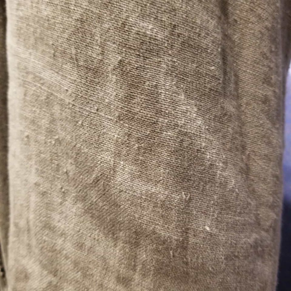
I work primarily with rough-edged brushes, whether in Photoshop or on my iPad Pro, to help keep things organic and painterly. I try to blend with color rather than with a blender tool as much as possible. But at the end of a piece, before my painting hits a printer or other people’s screens, I will almost always add some photographic texture. I have scanned images of various aged papers, canvas textures, fabrics; every type of clothing I own has been photographed for the texture library (not as impressive as it sounds, I am almost entirely a t-shirt and blue jeans person) – my dogs’ fur and foot pads, the drywall in my garage, the door of my car where my wife’s car door has hit it a million times – found texture is everywhere. When used well, it adds not only a splash of grit and grunge, but also creates some happy accidents, and gives a piece a “lived-in” look that I prefer.
There are wonderful online resources to get texture that other people have photographed (I’ll start at www.textures.com if there’s something specific I need), if you’re careful about using images in the public domain or stock photography that you’re paying for. I enjoy having my texture come from my own life when possible though; it gives me a personal connection to the work.
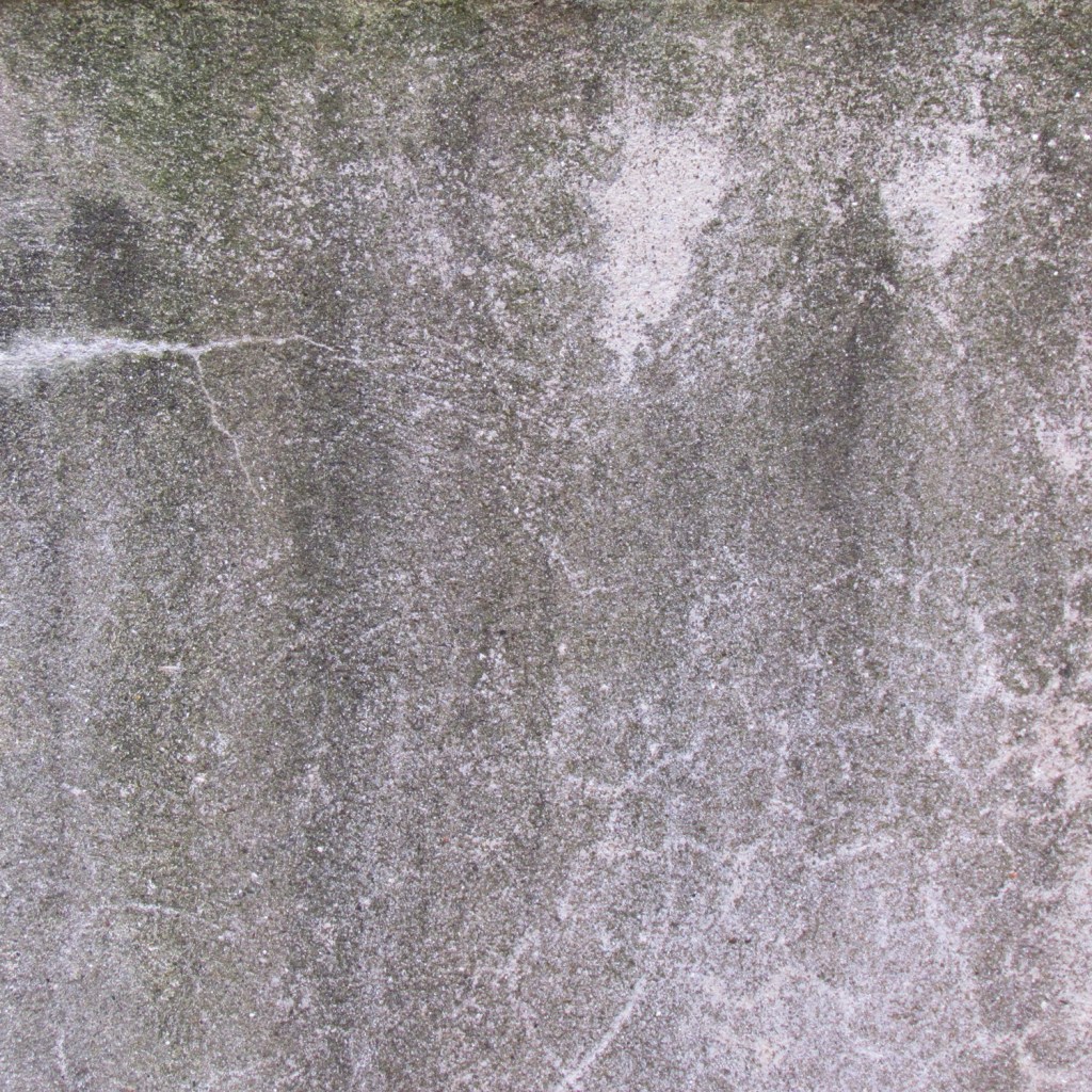
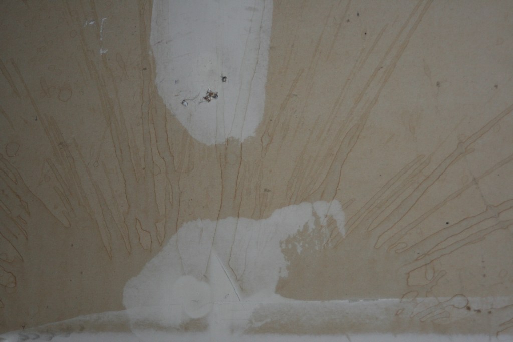
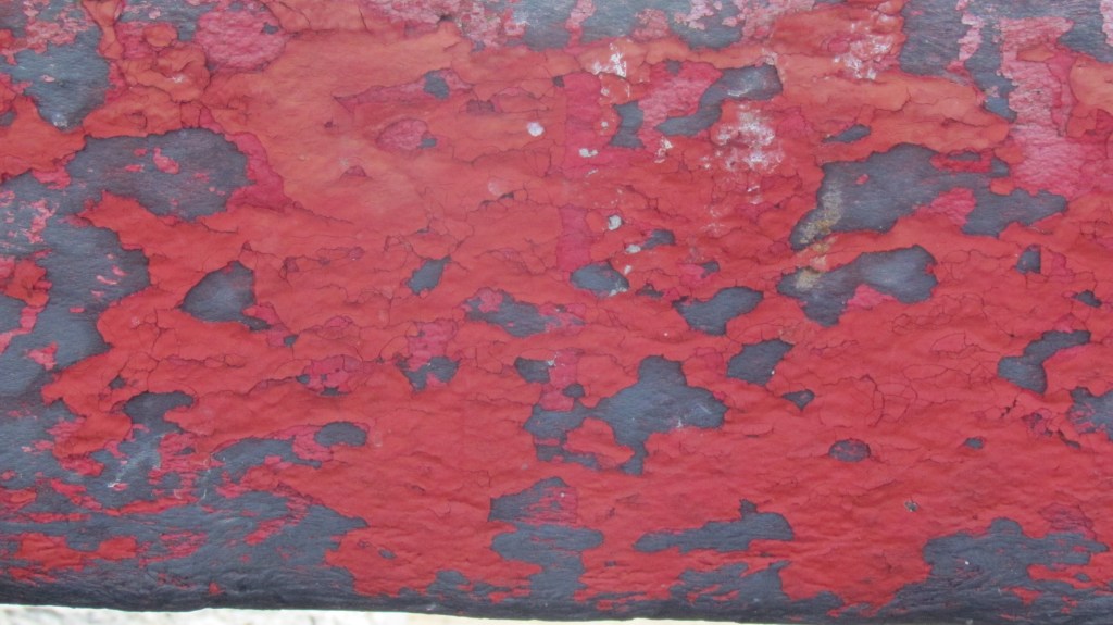
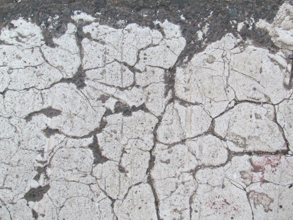
In particular, now that we all carry very good high-resolution digital cameras everywhere we go (on our phones), it’s very easy to gather textures out in the world. I haven’t traveled a whole lot of the world yet, but everywhere I go, I try to get some of the local surfaces photographed. I’ve got beach sand from St. Lucia, metal storage containers corroded by salt spray from the docks near Monterey, hundred-year-old multiply-painted wooden doors from New Orleans, concrete from the Hoover Dam, and cracked crosswalk paint from the Freedom Trail in Boston.
And when I need something extra, I’ve got the walls of the psych ward at Alcatraz.
Basically, I have made a habit of keeping my eyes open for the interesting decay of surfaces, anywhere I go. I gather the photos, then I try to keep them organized by place and date in my folders once they’re on the computer. I keep my working files in the cloud (on OneDrive but there are many other choices) so that I can grab them from whatever device I’m working on.
As for actually using these textures, it’s very easy in a software like Photoshop or my preferred iPad app called Art Studio Pro to use layer blend modes to overlay textures with a gentle touch. You don’t want the texture to take over, just to add some flavor. Low opacity and blend modes like Soft Light and Overlay do the trick for me. Here is an example.
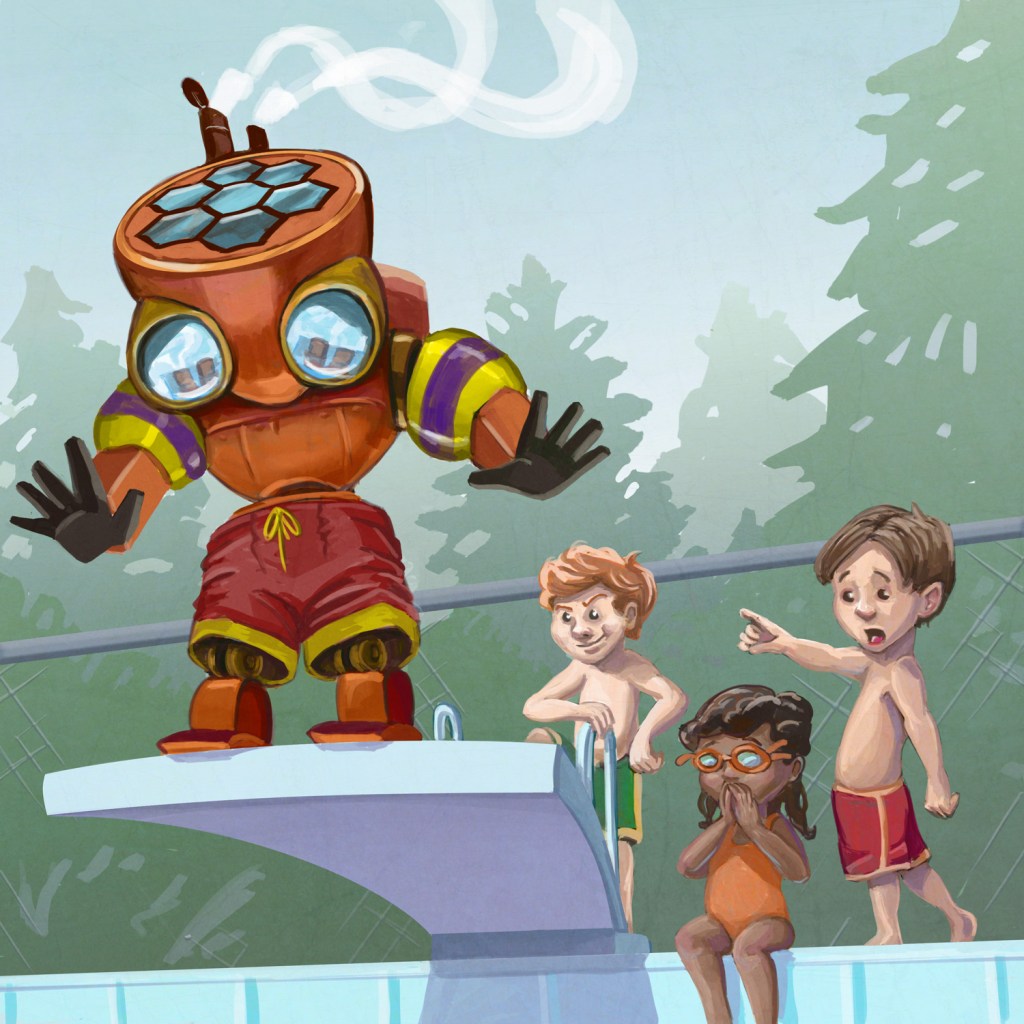
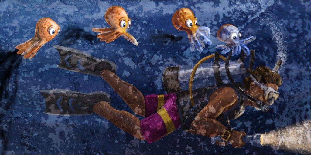
This is a spread from a book I’m working on called Octavio and the Aliens, based on a real-life scuba diving adventure I had in Cozumel. Here is the painting as I finished working on it:
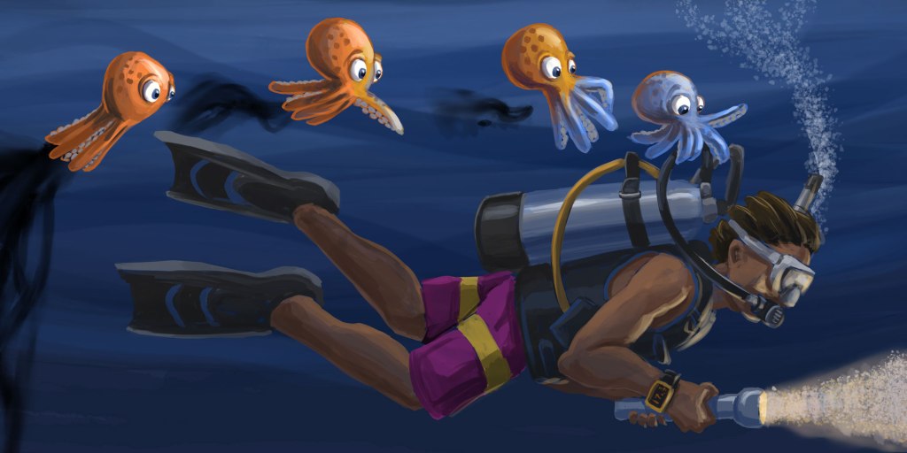
It’s looking good to me – a little loose but still controlled, I like the lighting – the whole thing is maybe a little dark, but mostly the edges and flatter surfaces are just too clean and “digital”. Now it’s time to get textural.
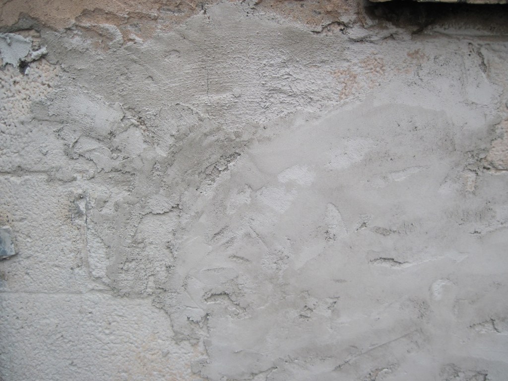
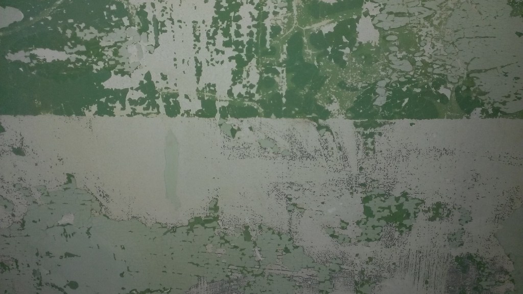
Since this book is based on a very important thing that happened to me at a specific time and place, I’m thrilled to have texture photos that I took on this same trip to Cozumel, Mexico – my first ever dive trip just a few years ago. Photos of water are mostly reflection and don’t help all that much, but I was taking pictures of cracked paint on concrete and interesting stone patterns and thatched roofs on beach huts. Snapshots of the textures in the world at that place and time. Here’s one, from the wall of one of the resort bungalows:
I know that I can use this in an Overlay mode at low opacity to both texture the piece (sea water is full of specks and bubbles and microscopic organisms) and to actually brighten up the piece a bit – it’s a light, high-key image and the Overlay blend mode will pick up on that. Here’s the painting with the photo on top with those settings:

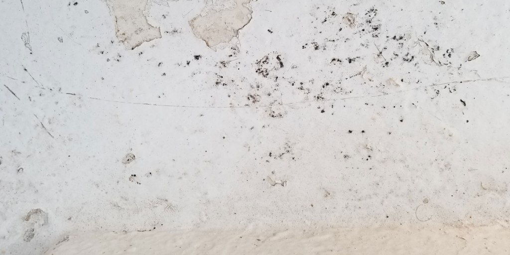
A little brighter, with a little more grit. I am rarely ever satisfied with just one overlay – it’s too easy sometimes to see what the original photograph was, and I don’t want that to be a thing that a reader notices – it’s just atmosphere. So here’s another photo, from a sandy floor area near the dive shop. It’s not in perfect focus across the image, but often that actually helps, to have some blur and such. Often I will also use just a corner of an image that has the texture I want – this is a crop that is exactly what is going to lay on top of the illustration.
This one I’m going to set to the Soft Light blend mode, which is the one I use most commonly. It lets most of the original image come right through and affects the lower layers in subtle ways. Even so, when I first drop it in and switch to Soft Light, it looks like something horrible has happened:
But then we drop the opacity, like so:
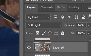
After experimenting by dragging the opacity slider around, I settle on 14% opacity Soft Light, and I’m thrilled with the final product.

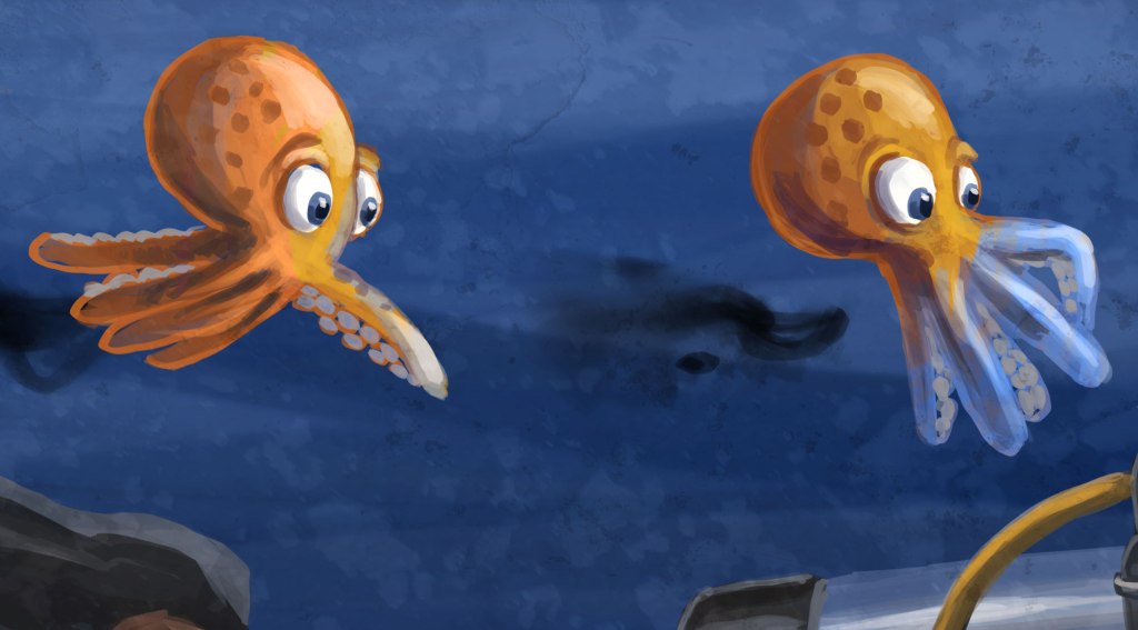
My painting now has atmosphere and some organic grit to it – suspended particles in the water, or a canvas I didn’t actually paint it on, just character like I wanted. And I did that with photos that I took a few hundred yards away from the place where I saw the most amazing thing I’ve ever seen, 20 feet underwater, the first time I was ever in the ocean at night. A book about an octopus in Cozumel is flavored by photos that I took in Cozumel. Not only do the images work and look like I want, but there’s a lovely sense of completion in being able to tie the real-life setting to the fanciful illustration in my story. Here’s a close-up to see the texture overlays in action:
There doesn’t always have to be a meaning behind a texture you use. The aesthetics are always the most important, but it’s a nice feeling to tie things up with a bow and deepen your connection with your own story. I’m sure one day I’ll be illustrating a story about an intelligent refrigerator with a penguin best friend that are exploring Mars, and those Bourbon Street doorways and Alcatraz prison walls will be exactly I’m looking for.
