It seems not a Cuddlefish Gang News update passes that we’re not congratulating Dow Phumiruk for something, and this quarter is no exception!
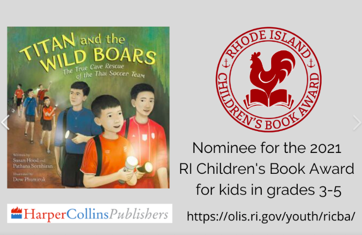
Congratulations to Titan and the Wild Boars, illustrated by Dow for being nominated for the 2021 Rhode Island Children’s Book Award for kids in grades 3-5.
But, we’re not done: we are thrilled about the recent announcement that Dow will be illustrating The Story of Tammy Duckworth by Christina Soontornvat for Candlewick!
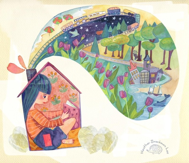
Brizida Magro is a Boulder, Colorado-based illustrator and educator. She teaches illustration classes at Rocky Mountain College of Art and Design. Brizida holds a BFA in Illustration from Brigham Young University and an MFA in Graphic Design from Utah State University. She is passionate about rock climbing, wandering the world and bringing stories to life. She works primarily in digital media, often with an analog touch that incorporates collage, ink, and china marker. She enjoys simplicity, whimsy, wee characters, and collecting vintage papers.
Raised by her grandmother and sister, she spent her childhood in a small Portuguese fishing town. Growing up, they would often make things by hand as a family. While her grandmother gardened and baked delicious cakes, she and her sister would spend time making clothes for their dolls and building twig shelters in the countryside. Her childhood has greatly influenced her current work, which blends together the innocence of vintage children’s art, the naiveté of folk art, and frolicking adventures through mountains and deserts.
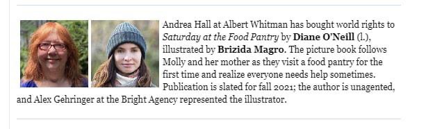
Brizida is such a rock star that we barely have time to announce that she’s joined us and we are already congratulating her on getting a book deal, illustrating Saturday at the Food Pantry by Dian O’Neill for Albert Whitman!
This is Cuddlefish Gang member, Stan Yan‘s portion of an RMC-SCBWI skillshare virtual illustrators’ connect, where he was showing how he uses the push liquify effect in Procreate to create a rippled water effect in an illustration. He also repeated this in Photoshop and showed some of the other liquify effects that are available.
I’d like to talk about using abstracted photographs of real-world texture to bring character to digital artwork.
I am primarily a digital artist, for children’s book illustration and most of the other work I do as well. One of the common complaints about working in electronic media is that digital painting has a “look” – too smooth, too clearly painted with round brushes and filters and smoothing tools. Ideally, I want my digital painting to have the impasto and grit of a painting on canvas and board. I want visible brush strokes, I want the piece to have clearly come from a human hand.
I work primarily with rough-edged brushes, whether in Photoshop or on my iPad Pro, to help keep things organic and painterly. I try to blend with color rather than with a blender tool as much as possible. But at the end of a piece, before my painting hits a printer or other people’s screens, I will almost always add some photographic texture. I have scanned images of various aged papers, canvas textures, fabrics; every type of clothing I own has been photographed for the texture library (not as impressive as it sounds, I am almost entirely a t-shirt and blue jeans person) – my dogs’ fur and foot pads, the drywall in my garage, the door of my car where my wife’s car door has hit it a million times – found texture is everywhere. When used well, it adds not only a splash of grit and grunge, but also creates some happy accidents, and gives a piece a “lived-in” look that I prefer.
There are wonderful online resources to get texture that other people have photographed (I’ll start at www.textures.com if there’s something specific I need), if you’re careful about using images in the public domain or stock photography that you’re paying for. I enjoy having my texture come from my own life when possible though; it gives me a personal connection to the work.
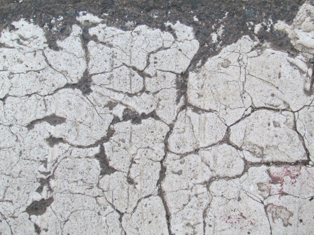
In particular, now that we all carry very good high-resolution digital cameras everywhere we go (on our phones), it’s very easy to gather textures out in the world. I haven’t traveled a whole lot of the world yet, but everywhere I go, I try to get some of the local surfaces photographed. I’ve got beach sand from St. Lucia, metal storage containers corroded by salt spray from the docks near Monterey, hundred-year-old multiply-painted wooden doors from New Orleans, concrete from the Hoover Dam, and cracked crosswalk paint from the Freedom Trail in Boston.
And when I need something extra, I’ve got the walls of the psych ward at Alcatraz.
Basically, I have made a habit of keeping my eyes open for the interesting decay of surfaces, anywhere I go. I gather the photos, then I try to keep them organized by place and date in my folders once they’re on the computer. I keep my working files in the cloud (on OneDrive but there are many other choices) so that I can grab them from whatever device I’m working on.
As for actually using these textures, it’s very easy in a software like Photoshop or my preferred iPad app called Art Studio Pro to use layer blend modes to overlay textures with a gentle touch. You don’t want the texture to take over, just to add some flavor. Low opacity and blend modes like Soft Light and Overlay do the trick for me. Here is an example.
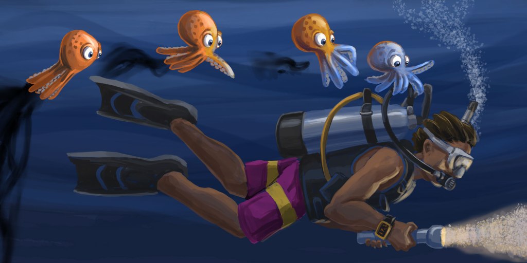
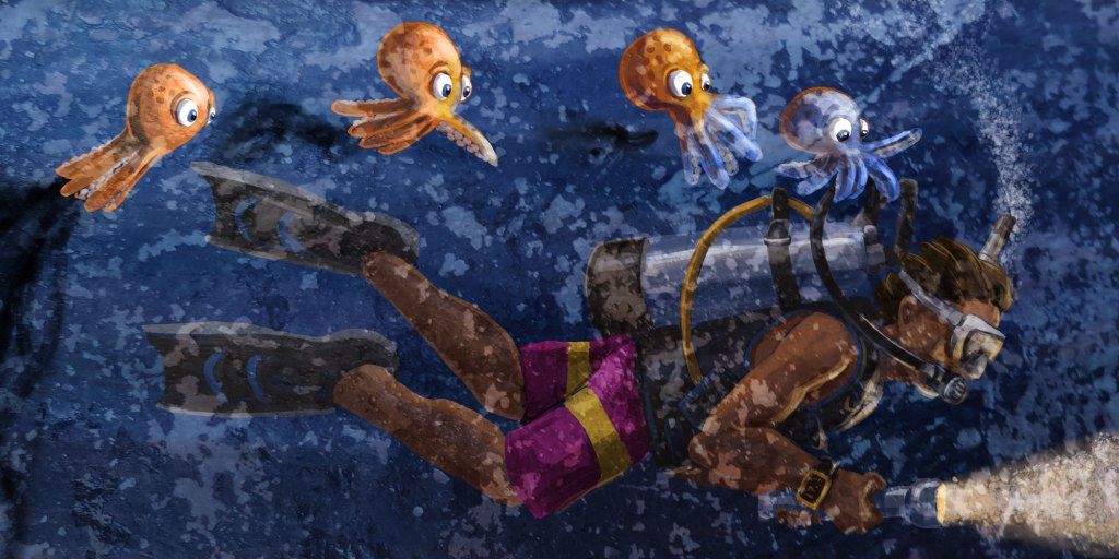
This is a spread from a book I’m working on called Octavio and the Aliens, based on a real-life scuba diving adventure I had in Cozumel. Here is the painting as I finished working on it:
It’s looking good to me – a little loose but still controlled, I like the lighting – the whole thing is maybe a little dark, but mostly the edges and flatter surfaces are just too clean and “digital”. Now it’s time to get textural.
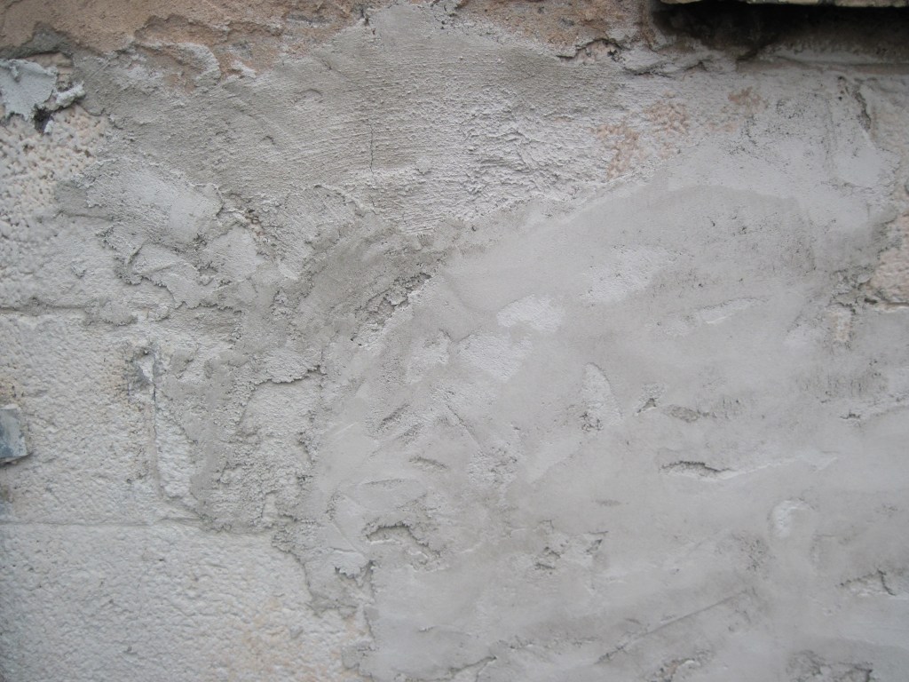
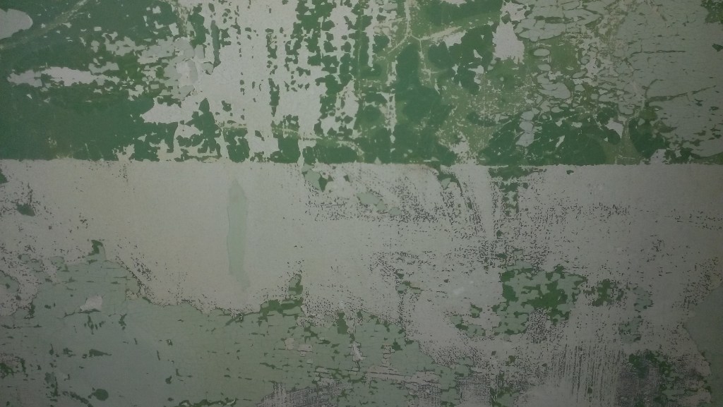
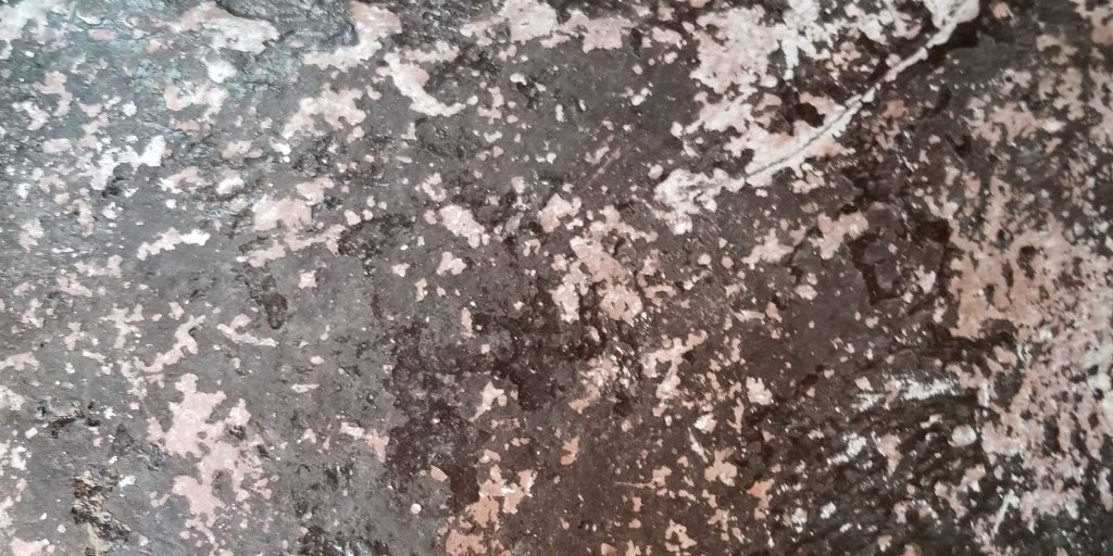
Since this book is based on a very important thing that happened to me at a specific time and place, I’m thrilled to have texture photos that I took on this same trip to Cozumel, Mexico – my first ever dive trip just a few years ago. Photos of water are mostly reflection and don’t help all that much, but I was taking pictures of cracked paint on concrete and interesting stone patterns and thatched roofs on beach huts. Snapshots of the textures in the world at that place and time. Here’s one, from the wall of one of the resort bungalows:
I know that I can use this in an Overlay mode at low opacity to both texture the piece (sea water is full of specks and bubbles and microscopic organisms) and to actually brighten up the piece a bit – it’s a light, high-key image and the Overlay blend mode will pick up on that. Here’s the painting with the photo on top with those settings:
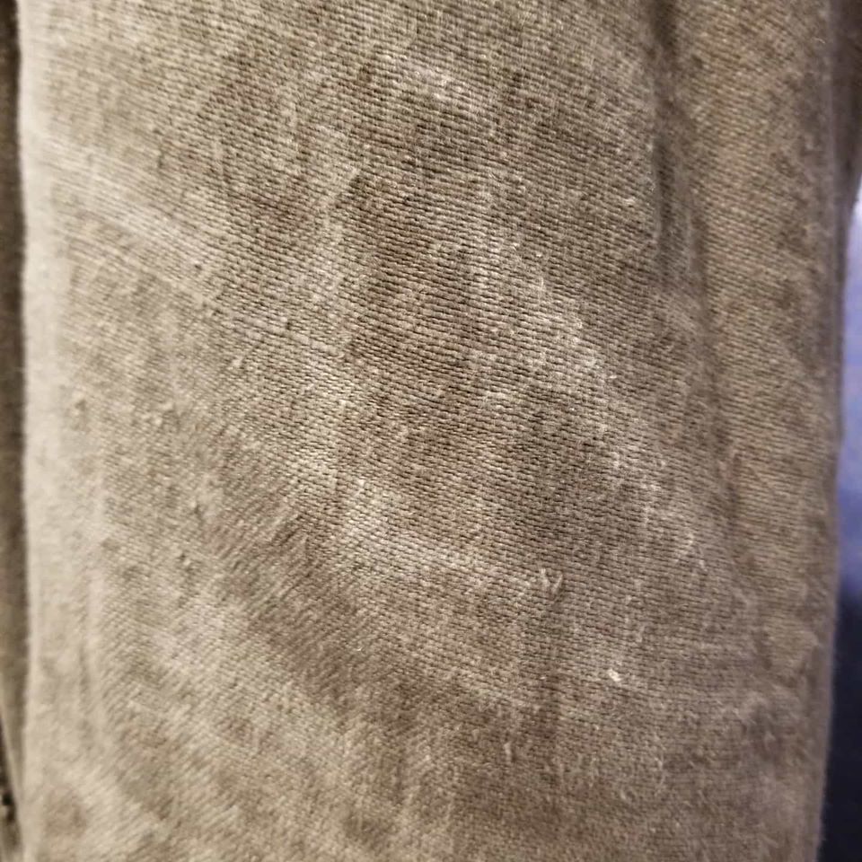
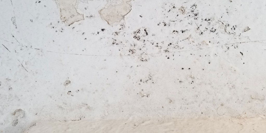
A little brighter, with a little more grit. I am rarely ever satisfied with just one overlay – it’s too easy sometimes to see what the original photograph was, and I don’t want that to be a thing that a reader notices – it’s just atmosphere. So here’s another photo, from a sandy floor area near the dive shop. It’s not in perfect focus across the image, but often that actually helps, to have some blur and such. Often I will also use just a corner of an image that has the texture I want – this is a crop that is exactly what is going to lay on top of the illustration.
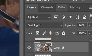
This one I’m going to set to the Soft Light blend mode, which is the one I use most commonly. It lets most of the original image come right through and affects the lower layers in subtle ways. Even so, when I first drop it in and switch to Soft Light, it looks like something horrible has happened:
But then we drop the opacity, like so:
After experimenting by dragging the opacity slider around, I settle on 14% opacity Soft Light, and I’m thrilled with the final product.
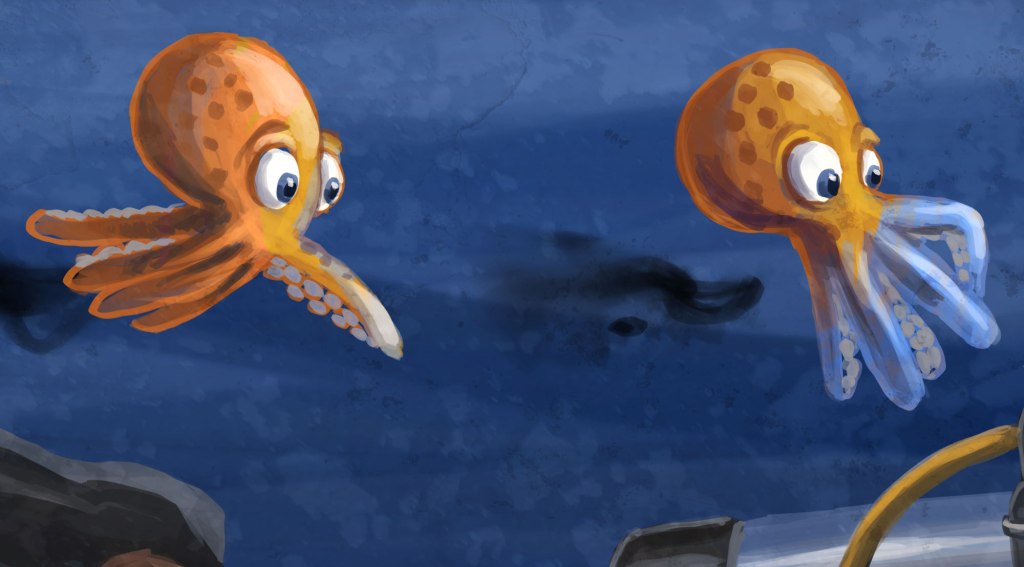
My painting now has atmosphere and some organic grit to it – suspended particles in the water, or a canvas I didn’t actually paint it on, just character like I wanted. And I did that with photos that I took a few hundred yards away from the place where I saw the most amazing thing I’ve ever seen, 20 feet underwater, the first time I was ever in the ocean at night. A book about an octopus in Cozumel is flavored by photos that I took in Cozumel. Not only do the images work and look like I want, but there’s a lovely sense of completion in being able to tie the real-life setting to the fanciful illustration in my story. Here’s a close-up to see the texture overlays in action:
There doesn’t always have to be a meaning behind a texture you use. The aesthetics are always the most important, but it’s a nice feeling to tie things up with a bow and deepen your connection with your own story. I’m sure one day I’ll be illustrating a story about an intelligent refrigerator with a penguin best friend that are exploring Mars, and those Bourbon Street doorways and Alcatraz prison walls will be exactly I’m looking for.
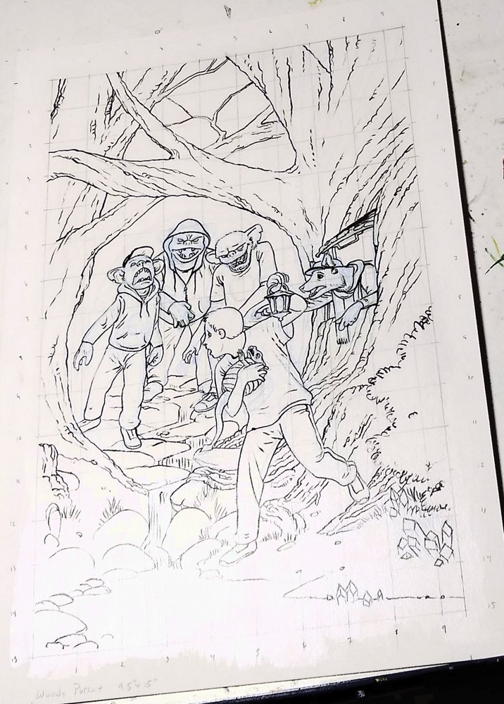
Going from a concept to a final artwork can be a mysterious affair. Because every artist has their own process, I can’t show you “how it’s done,” (no such thing exists). I can, however, show you how I do it. I’ll show you how I get from messy concept sketch to final ready-to-be-painted drawing. It’s sometimes funny, sometimes ugly, but hopefully somewhat informative.
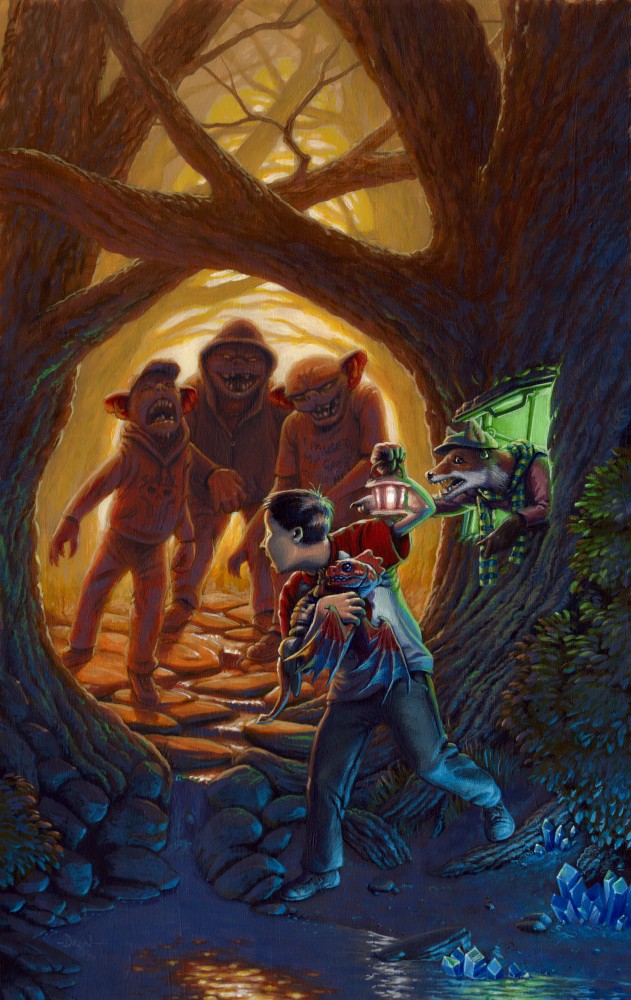
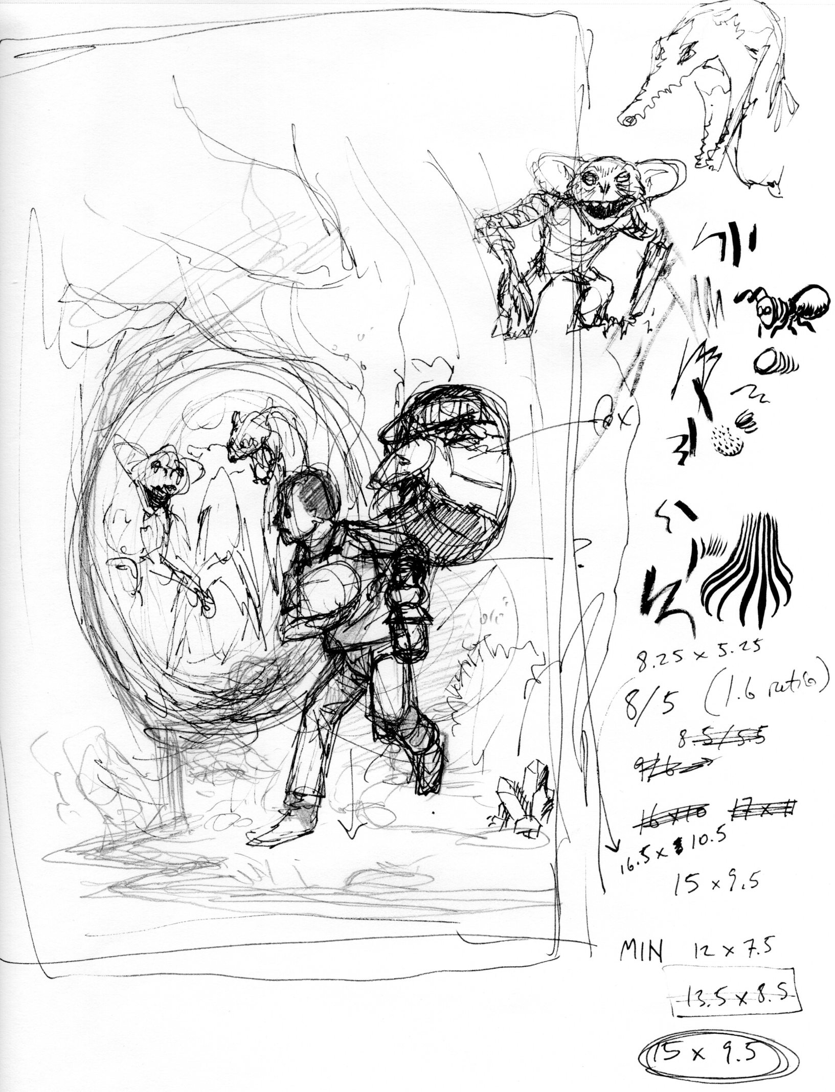
To the right is a painting I recently finished, and please note that all images can be clicked on to see them larger. But it didn’t start off ready to paint; first I had to come up with a concept and develop it until it’s ready.
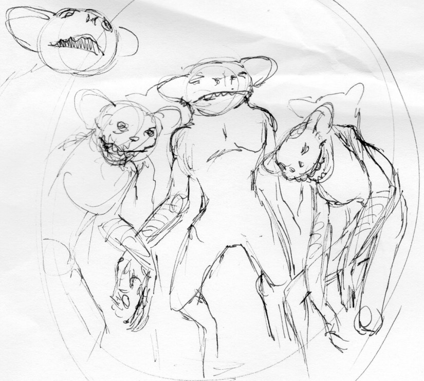
Just below you see the concept sketch, which lets us jump right into…
Lesson 1: Allow yourself to make ugly art.
Concept sketch
You know how people talk about finding the diamond in the rough? This is the rough. The point to a concept sketch is to find an idea, not to create polished artwork. That means that you’re using your artist’s eye to see the potential in the concept sketch. At least for me, good artwork is the end of a long process, and that process begins by allowing myself to make ugly (sometimes horrible) art.
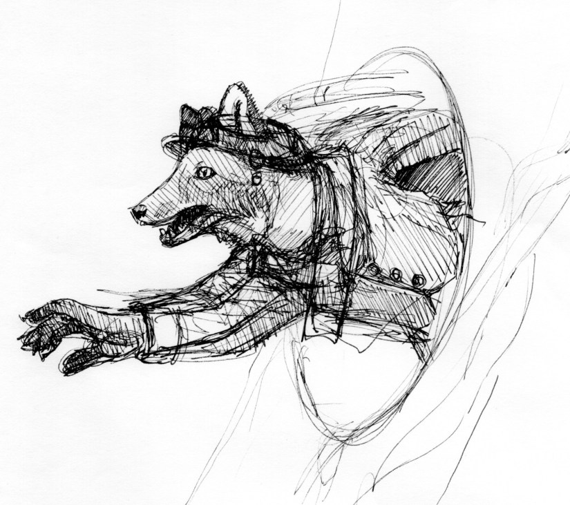
The refinement comes later. For example, the creature reaching out from the right in the concept sketch was rough. What is that thing? A rat? A weasel? Spuds MacKenzie reaching out from the 80’s? NO! It’s a fox! Which you’d know if you could see into my mind’s eye. Which you can’t. It’s not even clear that I can draw what’s in my head. I need to develop these characters more before I know whether my ideas will work.
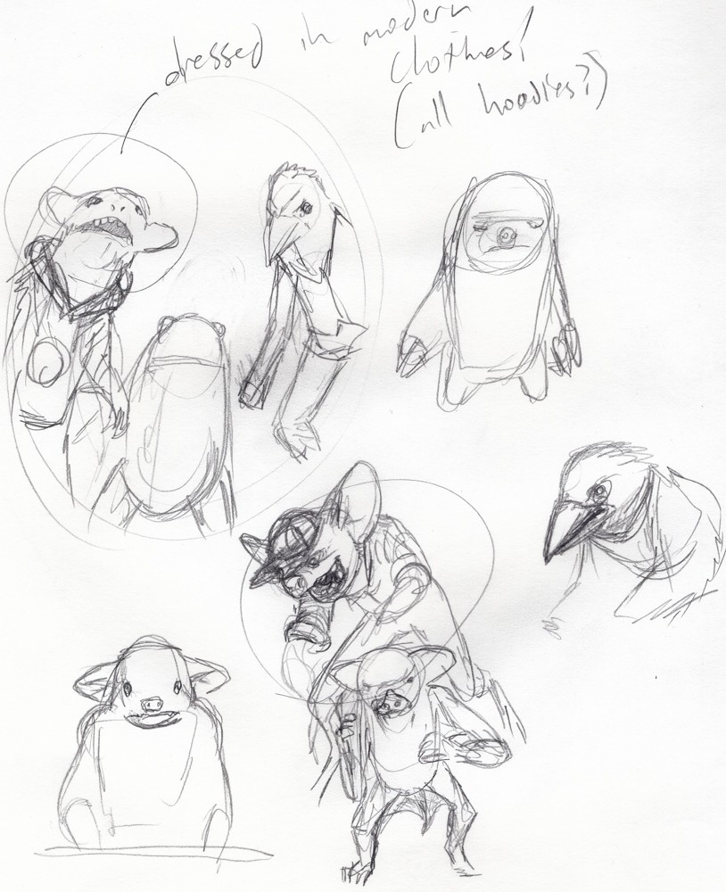
Above you see sketches for the fox character and the goblins. The fox is in a pretty good place, whereas you never see the final goblins; I’m working them out in my head, with sketches on the paper simply as an aide. The poses can change, but now I have real character with details and a feeling I can grab onto. I used the computer to add the new fox into the scene, below.
Some things are still in the air: the main character, whatever he’s holding, the design of the creatures chasing the hero, etc. But the parts I needed to figure out in sketch are done. Next comes…
Lesson 2: Photo references.
When I was starting out many years ago, I thought that the use of photo references was for amateurs and wannabees. Real artists had enough anatomical knowledge and robust imaginations that they could bring forth everything they needed from their minds, fully formed, like Athena bursting from her father’s cranium.
I thought this because I was young and stupid.
I was wrong, and my art improved many times over after I got past that stumbling block and began to use photo references. Quite simply, there is so much to anatomy, lighting, the draping of fabric, and more that few artists can conjure it all from thin air in a genuine way. For most of us, it won’t have the authenticity of an image based on carefully chosen photo references.
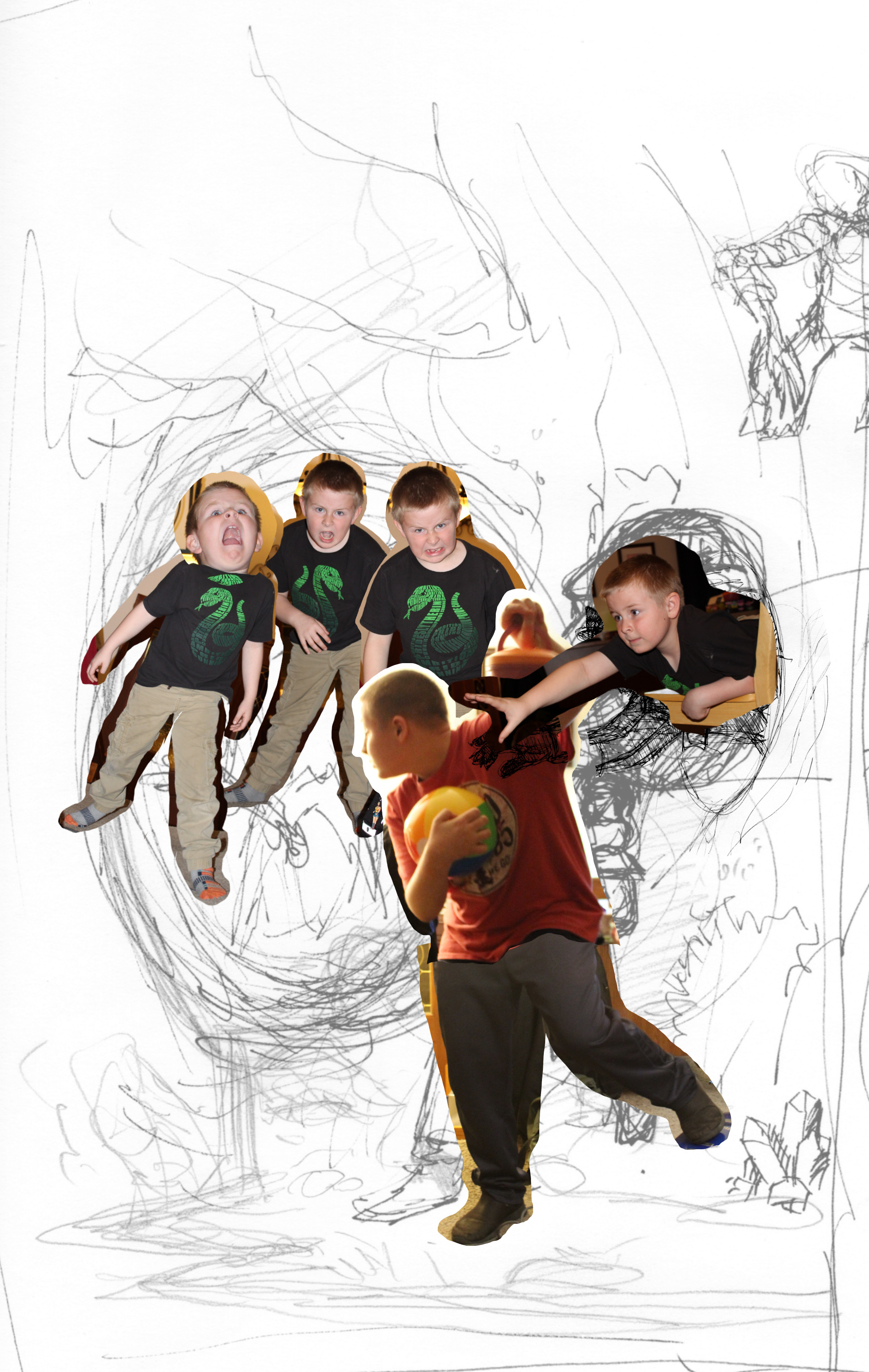
If you’re just starting out and need permission to use photo references and still feel like a real artists, you are now granted that permission. I use photo references, an so do most of the professional artists I know.
Back to this piece. My next step was obvious – go find some goblins to pose for the camera. When I couldn’t manage that, I did the next best thing – I got my children to pose. Seriously, children are fantastic for getting photo references of strange creatures. They love this kind of thing. They get into it with a passion. Look at those pictures of my younger son as the goblins. He jumped into that role and became those goblins.
My thirteen year old allowed me to take a few pics, too.
Your project may call for you to cajole the help from friends and family, find online images, or even pay a professional model. Whatever your needs, don’t do what I once did and convince yourself that you can do well enough without. Find and use references.
At this point, I have a final concept and I can move on to creating the final underdrawing –i.e. the drawing to be painted over. I’ve worked out that I want the final to be 9½” x 15”. That fits the dimensions of a mass market book cover with bleed added around the edge, scaled up to a size that will let me get some good detail without taking too long to paint. You can see me working that out on the right side of the original concept sketch. Art math!
The problem is that the sketch is only a few inches across. The solution is…
Lesson 3: The Grid.
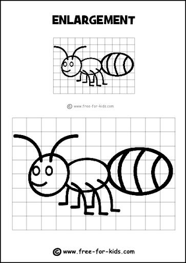
The grid method of recreating and enlarging has been around for at least several thousand years. The Egyptians used it. Medieval artists used it. And today, most children come across small versions of the grid method in activity books. I remember using it to recreate a Scooby Doo drawing in the parking lot of an Albertson’s when I was young.
If you haven’t used it, or at least not since you were a small child yourself, the concept is simple: you create a grid on the sketch, and a larger version of the same grid on the painting surface. Then you simply redraw what’s in each square.
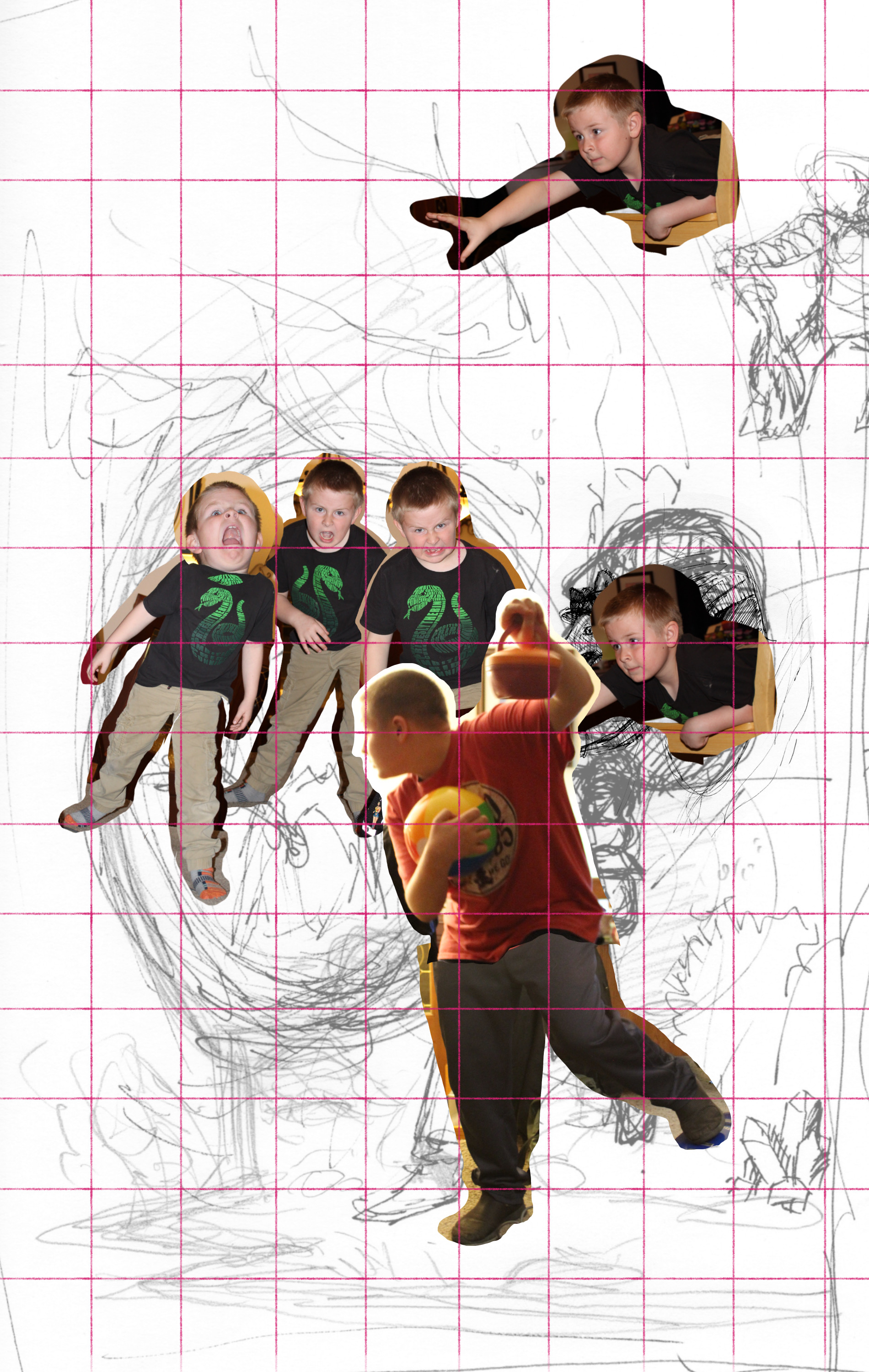
To make the measuring easy, and because a one-inch-square box seems about right for the amount of detail to transfer at a time, I use a ruler to draw lines one inch apart all the way down and across my drawing. Then I scan the sketch onto the computer, open it in a Photoshop-style program, set the live portion of the sketch to the same dimension as the intended painting, and use the guides and line tools to create the same grid (on a separate layer from the drawing itself). I print this out, then number the lines from top to bottom and left to right on both the printed sketch and the final painting. You could, alternately, number the boxes between the lines; it doesn’t matter, as long as it works for you.
Final inks.
In the image to the left, you can see the gridded sketch, and on the right, the final drawing. The numbers are visible down and across the sides. Each square (for instance, the one starting at 3 across, 5 down) contains the same thing as the sketch, only refined and developed for the final painting.
There you go. You’re ready to use the grid method as well as a professional artist. Or child. Or Egyptian.
Until next time, go make ugly art. Then make it beautiful.
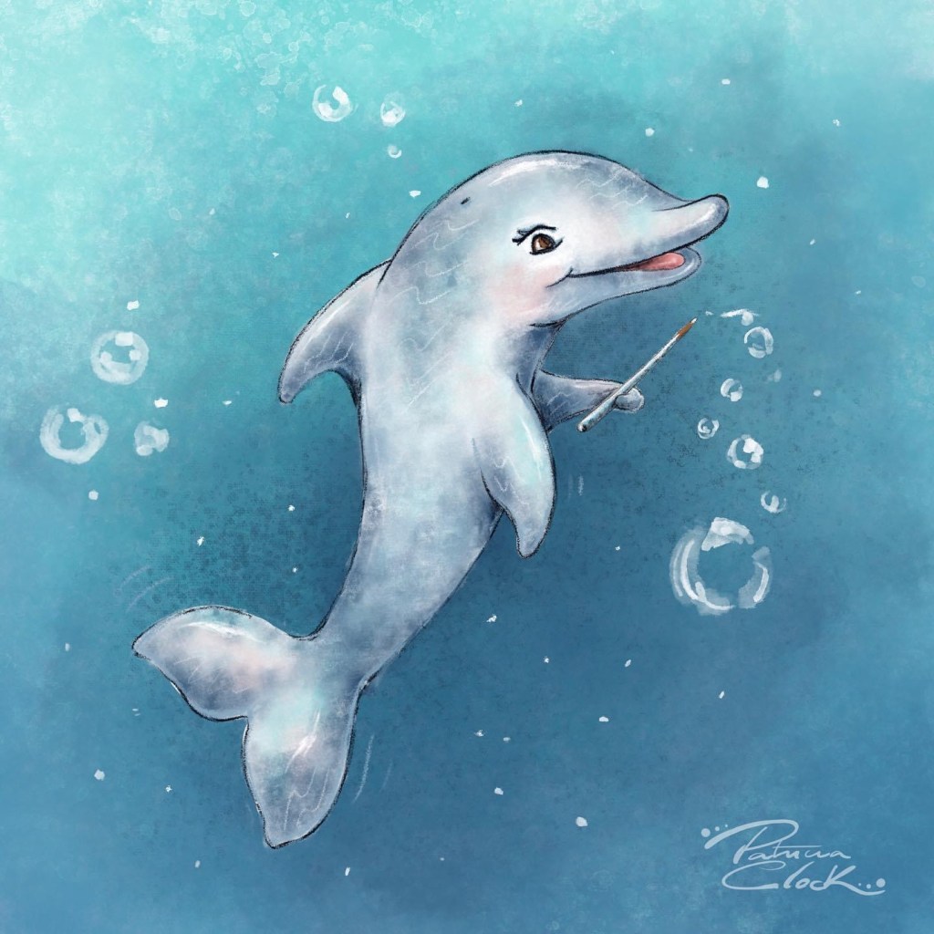
Finally, we would like to welcome Patricia Clock to the Cuddlefish Gang!
Patricia Clock is an author/illustrator and graphic designer. She is a native of Rio de Janeiro, Brazil, where she grew up surrounded by the ocean, the mountains, and a culture that is full of color. She graduated from Faculdade da Cidade with a Bachelor of Arts Degree in Graphic Design and Acting, she worked in the art department for Sony Music Entertainment Brazil, creating CD covers and marketing materials before moving to the United States in 2005. Denver, Colorado, was her first home far away from home, but after a year, she moved to northern California with her husband, where they had two children.
In 2018, after moving back to Denver, Colorado, she started working at her neighborhood elementary school, Willow Creek, and discovered her passion for children’s literature and decided to focus on Children’s picture book illustrations, and became a member of SCBWI.
She loves her family, to laugh, chocolate, white sand beaches, horses, dancing, and be with friends.
Stan Yan reveals tips and tricks for breaking into the comics and graphic novel field. What you need in your portfolio, plus best ways to get seen, get an agent, and find work.
When we get to a certain age, I think most of us forget that when we were kids we totally knew what was going on. Sure, maybe we didn’t really understand that raunchy song that played on the radio… and sure, maybe we didn’t totally get why we cried when mean words were thrown at us. But we felt the joy in the music and we felt the pain in the words. So why is it that so many adults think that kids media needs the information to be dulled down for kids to understand it? Why do adults think kids aren’t paying attention to the world around them?
Dulling (or dumbing) down information is when we take ideas and words and make them simple and easy.
Distilling information is when we take ideas and words and make them more precise and effective.
This is the difference that children’s book authors and illustrators must keep in mind when making books for kids.
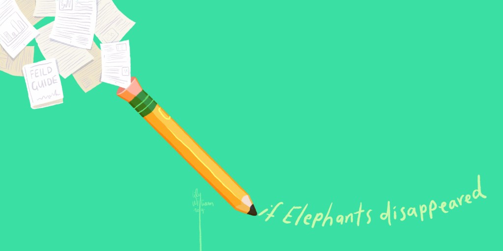
I write and illustrate a series of nonfiction picture books called the If Animals Disappeared books. These books take a look at the trophic cascade in various ecosystems and the cause and effects that the elimination of a keystone species can have on our planet. This series takes a lot of research and distilling the information can often leave me with a headache. When writing them, I keep this idea of “dulling versus distilling” ever-present in my mind. If I dull the information, it will make the science less effective and the story has little impact. However, if I distill the information, it will make the point hit home harder and inspire change in the hearts and heads of readers. While both dulling and distilling are forms of shortening complicated information and topics when you distill the information you keep the impact.
Example from If Elephants Disappeared (written and illustrated by Lily Williams, published by Roaring Brook Press September 17th, 2019)
Dulling: “African Elephants are important to their environment in a lot of ways because they are a keystone specifies. Because of this, it is necessary to keep them alive.”
Distilling: “Elephants are a keystone species, which means that their actions — from walking to eating, to pooping to sleeping — shape their environment. Without keystone species, the ecosystems they live in, such as African tropical forests, would change dramatically.”
I have read my books aloud at a lot of bookstores and I have not encountered one single kid to not understand the concept and the impact that we have on our planet, because my words are distilled (not dulled). Once we finish reading my books, most kids want to write to their representatives and help save the animals and their ecosystems. Young readers understand the importance of the animals and the cause and effect eliminating them has on our planet as a whole through carefully distilled word choices and effective illustrations. They understand that these animals are endangered and I am able to help them process what it means to be endangered and how that could eventually affect them at home. Giving kids the information and tools to make positive impacts on our planet, helps empower them as young people.
It is important to know that contrary to the way kids react to my books, many adults find my books to be any variety of “too upsetting” and “too advanced” for children. To them I say, you must not be talking to kids like they are people too. Kids hear the news, listen to their parents, overhear conversations in public, and know that topics like climate change are real (the topic of If Polar Bears Disappeared); however, if we do not give kids the tools to understand the long term impacts of their actions and honor them enough to give them the space to process the information… What are we doing and why are we doing it?
This is why it is important to distill the information rather than dull it down. The kids are listening and reading, they are growing and finding their identities every single day. We owe it to them to empower them with effective information to make better, more educated, choices as they continue to grow up and find their place in this world.
Stan Yan couldn’t believe this was the 50th San Diego Comic-Con, and his EIGHTEENTH year of exhibiting! And, while he didn’t exceed his record sales from last year, there were a lot of things that made this particular year particularly special.
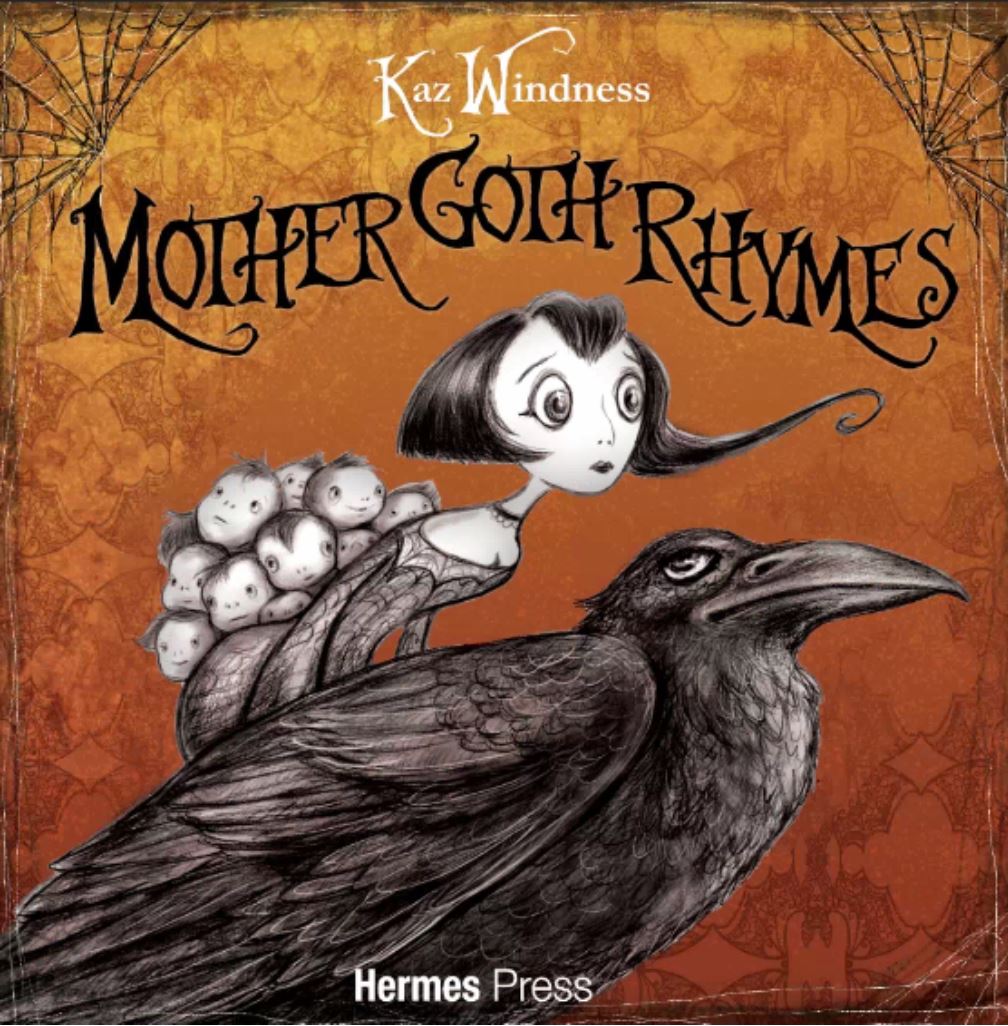
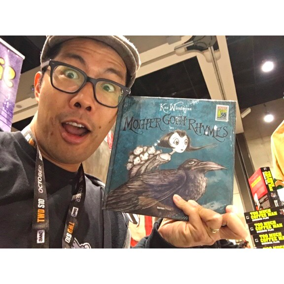
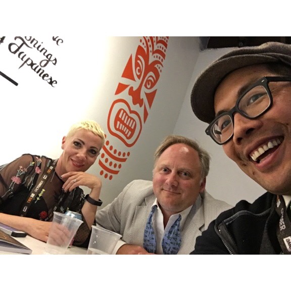
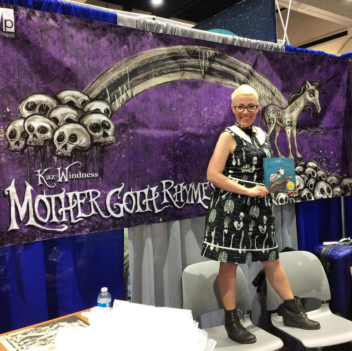
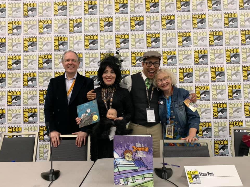
Firstly, his good friend and fellow Cuddlefish, Kaz Windness, who was debuting her convention exclusive edition of Mother Goth Rhymes, invited him to participate in a panel about horror in comics, which Stan said was great fun, and featured comics legend, Trina Robbins!
Secondly, there were fun meals with friends almost every night, including some with Kaz, her agent Timothy Travaglini, kidlit superstar, Salina Yoon and her phenomenal artist husband, Christopher Polentz!
Thirdly, although revenues weren’t up, he was extremely happy to say that he sold 37 copies of There’s a Zombie in the Basement this year (not to mention almost 200 buttons and stickers)! GO STAN!!!
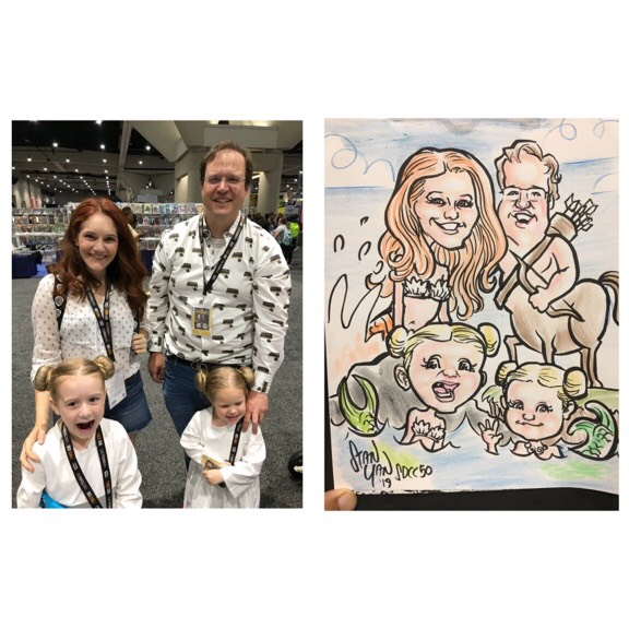
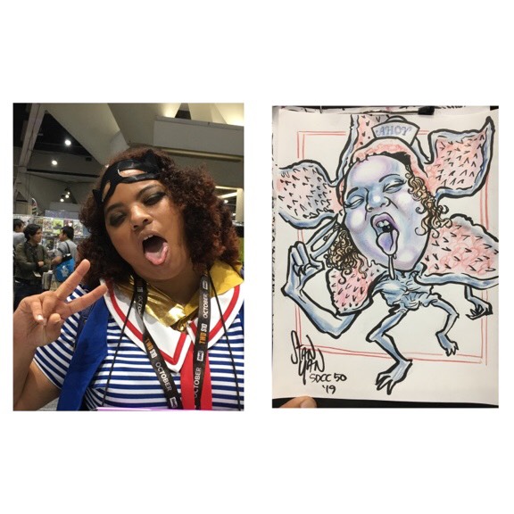
Of course, he doesn’t want to understate how many great caricature customers there were! He received 40 zombie, pony, and other character commissions (62 subjects), finishing 31 (50 subjects), and will attempt to finish and ship the remaining drawings to folks over the next two weeks. Sounds like Stan is going to be a busy guy!
You can view his complete gallery of drawings from Comic-Con at http://stanyan.me/2019-san-diego-comic-con-report/, which will be updated as his illustrations are completed! Brilliant work as always Stan!
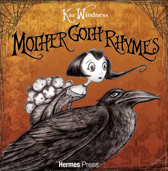
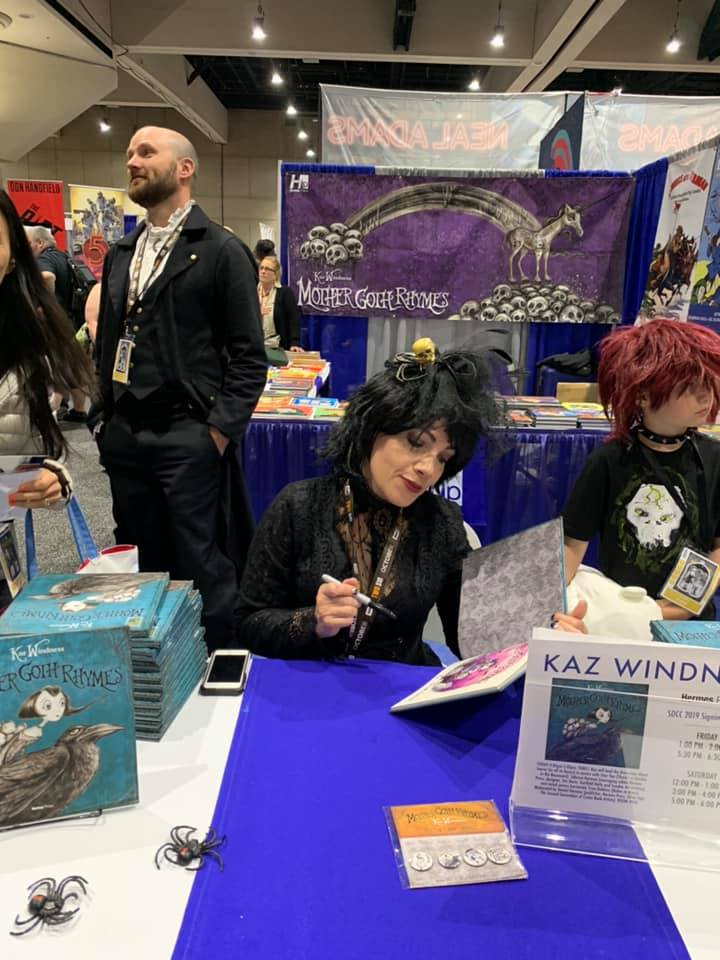
Cuddlefish member, Kaz Windness just got back from San Diego Comic-Con and has earned the affectionate nickname of “sell-out.” Why?
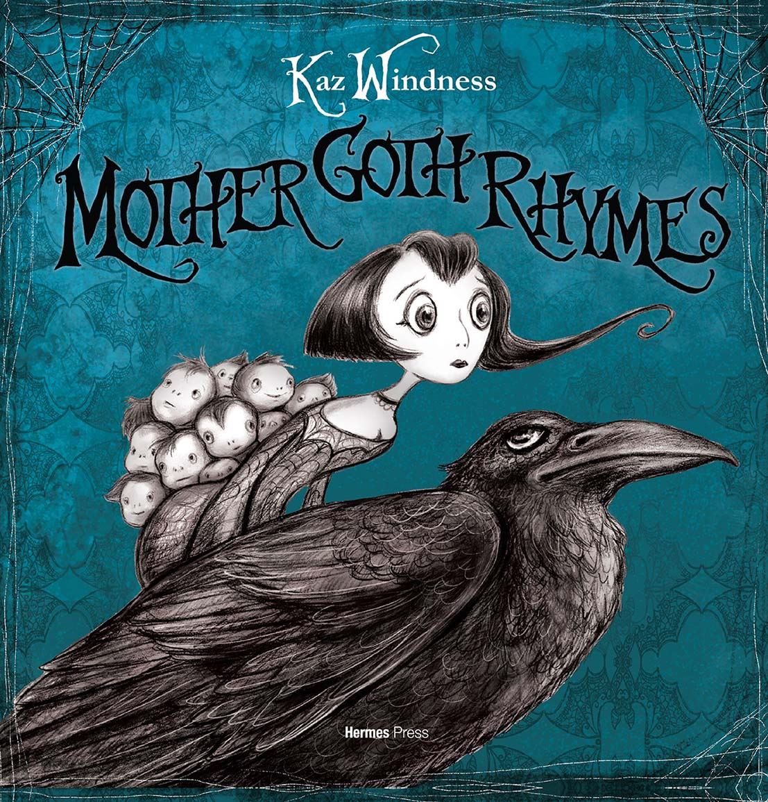
Here she is at the Hermes Press booth, seeing her book for the very first time. Hermes Press decked their display with a 10-foot banner featuring Stabby the Unicorn and ran a special comic-con exclusive limited edition version of Mother Goth Rhymes with a teal cover and full-color signed and numbered tip-in sheet. Mother Goth Rhymes received extra-special treatment.
This is the SDCC limited edition teal cover with signed, full-color tip-in sheet.
Hermes Press brought just over 210 copies at the conference with a special cover price of $49.99, and here Kaz is on Saturday afternoon selling the last copy! “Hermes told me this never happens,” quipped Windness. “Only Jim Davis [Garfield creator] sold every last copy. But by Saturday afternoon, we were taking orders for the special edition copies left back at the office, with free shipping, of course. Considering how many nightmares I had that I wouldn’t sell a single book, this came as a surprise and total thrill.”
On Friday afternoon, Kaz shared the panel stage with fellow Cuddlefish member, Stan Yan, and comics legend Trina Robbins for a discussion about women in horror and finding humor in the macabre, facilitated by Hermes Press founder and president, Dan Herman.
And perhaps the best thing is that Kaz’s book is officially out and pre-orders will be mailed on August 13th. You can get your copy HERE for only $24.99.
We asked Windness for any final words of advice for showing at Comic-Con.
“Bring business cards and some freebie handouts like button pins or vinyl stickers to go with a bigger ticket for-sale item. And NEVER trust natural deodorant to do the trick. It is no match for the power of Comic-Con.”
Congratulations to our sell-out, Kaz Windness, and here’s to the creepy world of Mother Goth!