My painting process using digital and traditional media by Heather Brockman Lee

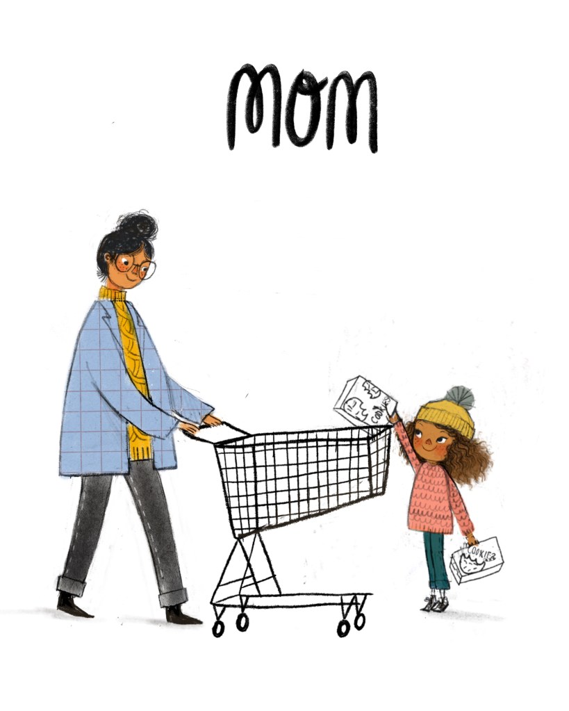
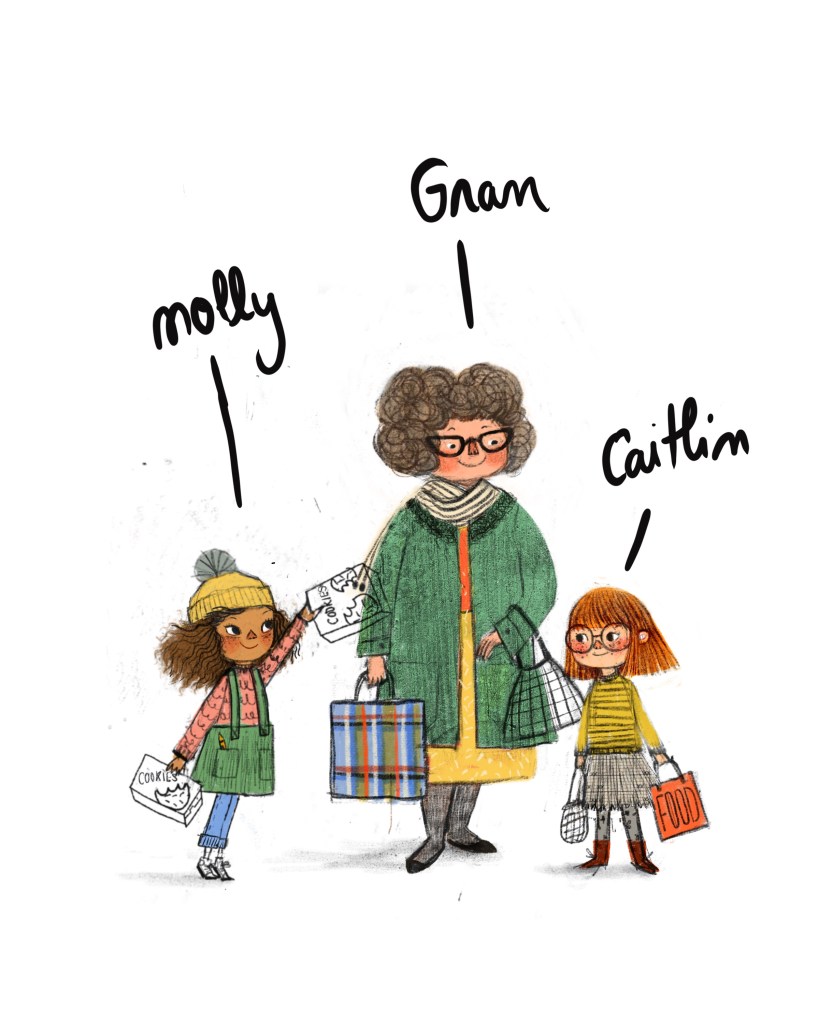
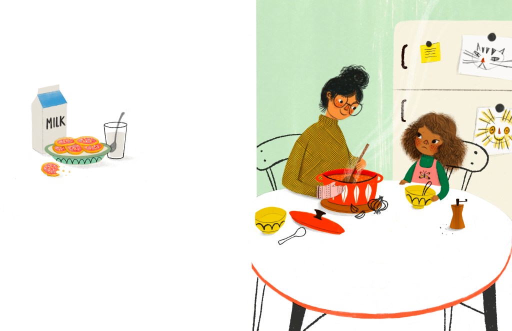
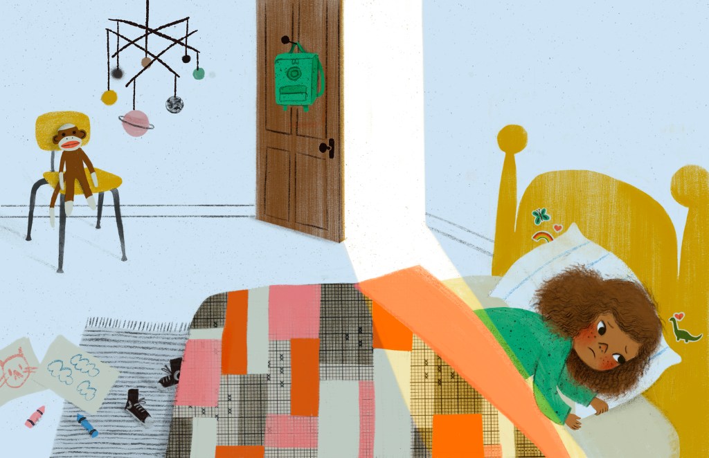
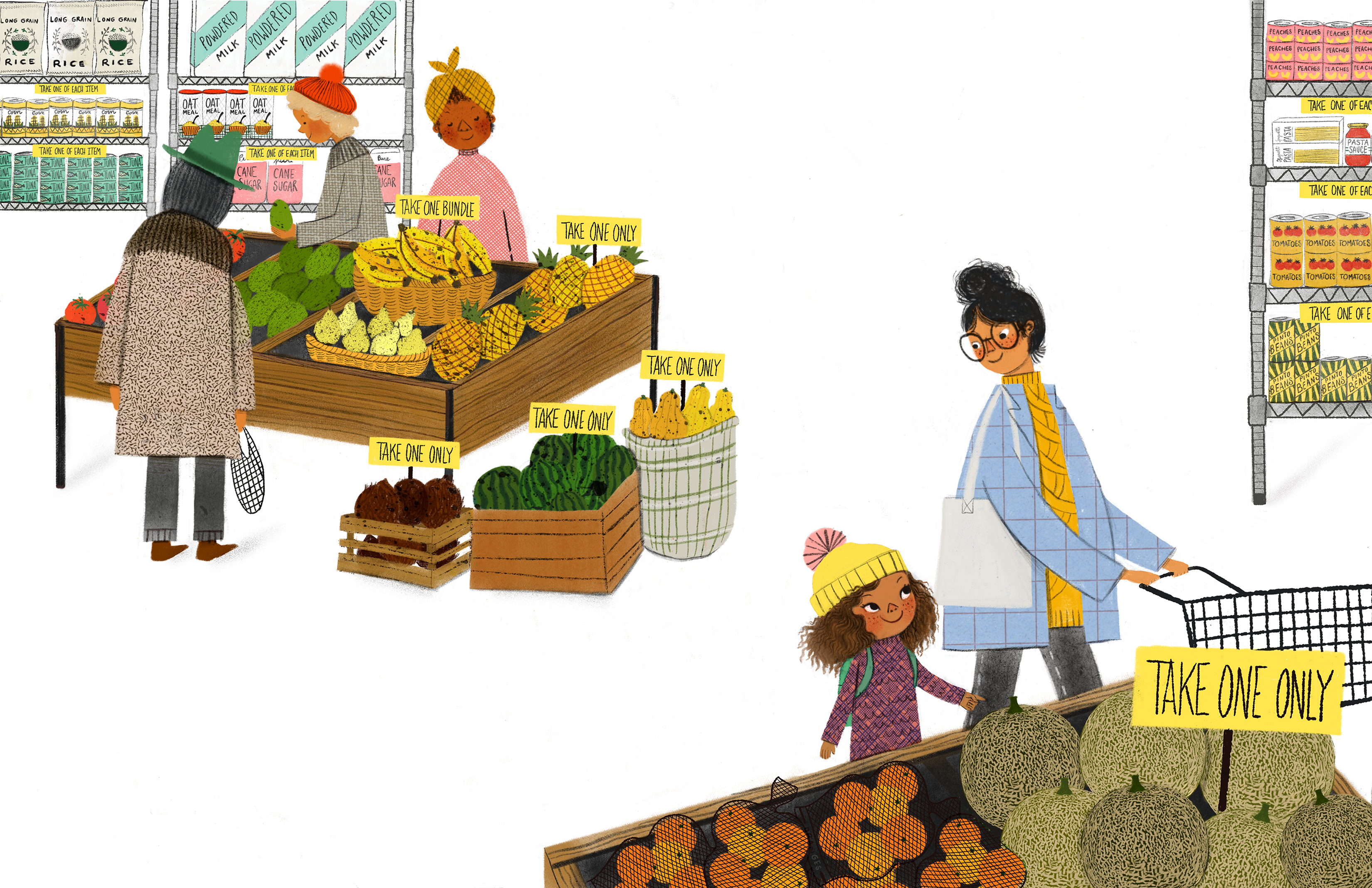
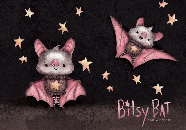
I often hear illustrators asked if they work traditionally or digitally, and there is certainly no wrong answer to this. I adore many illustrations that were made either completely digitally or with traditional methods. In the end, the principles of good illustration are the same. But my personal answer to that question is WHY NOT BOTH? I love using digital tools to streamline my process, correct mistakes and elevate the image in general- but when it comes time to sit down and paint, I much prefer to work on paper. There are a lot of reasons for that- my background in fine art, my wrist and eye health, and maybe most of all my love for experimenting with different papers and supplies. I will talk a lot more about paper specifically in future blog posts because I think it is the unsung hero of art making. But for now, I want to lay out my basic process for creating a painting (including the ones in my upcoming picture books)- I hope you enjoy!

Running into Spring

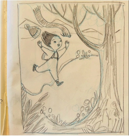
Everything starts in my sketchbook, whether it’s scribbled thumbnails or something more finished like this piece, which was inspired by the way Colorado has many more than four seasons, often in the same week. (Like around 20?) I think better on paper so most of my brainstorming happens with a pencil.

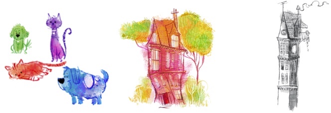
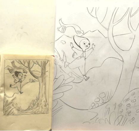
Next, I like to refine the sketch on my iPad. Procreate is great for this- you can select and resize, flip the image to check the composition and figure out your palette. Once I’m happy with the line drawing, I’ll often block in color. It’s an extra step, but it helps me to figure out the palette and values beforehand so I’m not guessing once I go to paint.

This is also a great way to check that the values are working.

Then, I print out the sketch to the size I want to paint. If I am working on a picture book, I might need to print out several sheets and tile them together to get the correct size. Here, I’m just using what fits on an 11”x17” piece of recycled printer paper.

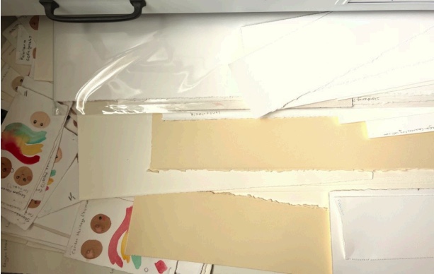
Speaking of paper… now I get to choose what kind to paint on! I obviously have lots of options, and for this painting I decided on a cream colored printmaking paper. It’s soft and absorbent with no sizing, and I really like using watercolor and colored pencil on it.

I have a big light box my husband bought me from an architecture firm a few years ago for Christmas (he found me some great flat files too!) and I use it constantly for tracing sketches onto the paper.

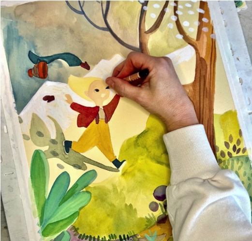
This is my favorite part, the painting process. It never looks great at this stage, but I love the way the brush, paint and paper all interact. It’s very soothing.

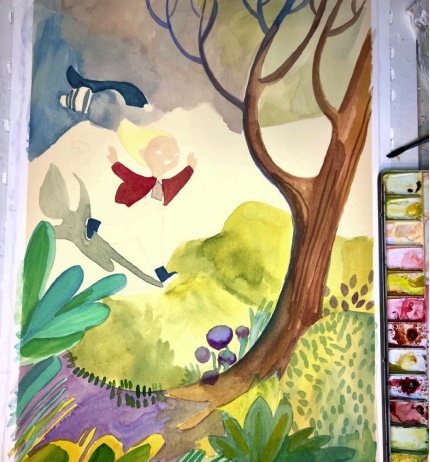
For this method, I do a lot of details in colored pencil. I try not to overwork or hide the interesting variations in the paint.

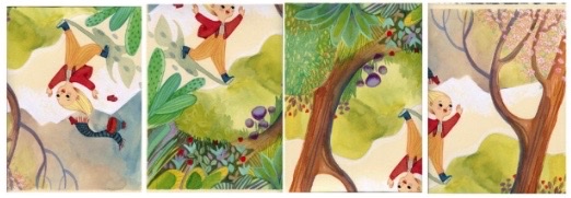
Once I feel like it’s finished, it’s time to scan! I have a good scanner but it’s pretty small, so I have to scan in sections and end up with something like this:

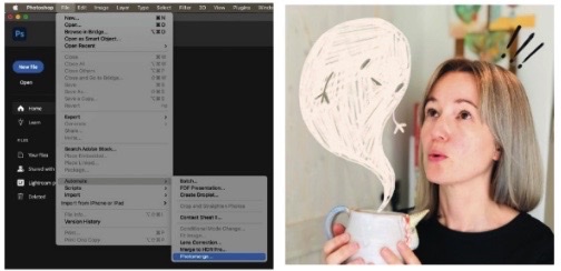
Then I use the MAGIC of Photoshop’s photomerge feature to stitch it all together while I make a cup of tea!

Okay so, at this point I was going to tell you all that I use the clone stamp to clean up dust specks and the levels adjustment layer to tweak the values but… I realized I had a bigger problem. That shadow I had so much fun painting is shortening the distance between the girl and the snowy hills behind her. It kind of looks like a wall? If this were for a book, I would repaint the whole thing (or hopefully would have caught it much sooner in the sketch phase!) But since this is just a personal piece, I’ll use some more photoshop magic to select the shadow and tweak it so it looks like there is more distance.

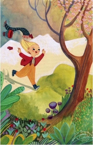
There! Smack my logo on it and it’s ready to post on instagram or a blog! Thanks for sticking with me this far. I hope you all enjoyed this sneak-peek into my studio and if you are a creative person too, I’d love to hear something about your process in the comments!

Heather Brockman Lee

Twitter: @heathertbl

Instagram: @heatherbrockmanlee

Website: www.heatherbrockmanlee.com

Good News: January 2022

Firstly, we would like to welcome our newest member, Annie Herzig!

After departing the corporate foodie world as an art director in 2014, Annie Herzig returned to her first loves of illustration and storytelling. She works using a combination of traditional and digital media, often utilizing watercolor, gouache, graphite, and colored pencil on the page.

Delighting in awkward, funny, and heartwarming interactions, Annie incorporates relatability and humor into her work, while developing lovable characters and getting to know them as close friends. Having experienced loss, she also explores themes revolving around grief and shared human experience, seeking to both offer and find connection with others.

You’ll often find Annie drawing for hours in her studio with John Denver records on repeat, pausing for tea and cookies, then getting outside before the sun sets to breathe some fresh air on a mountain trail. Come visit her at annieherzig.com.

Annie is represented by Charlotte Wenger at Prospect Agency.

Website: annieherzig.com
Instagram: @annieherzig
Twitter: @annieherzig

Congratulations to Dow Phumiruk who illustrated Titan and the Wild Boars, which won the Rhode Island Children’s Book Award for 2021!

Also, congratulations to Dow for getting her art from Hello, Tree into the Original Art Show NYC!

Not to mention being named A Mighty Girl’s 2021 Book of the Year!

In addition, Hello, Tree, also illustrated by Dow is now being translated into other languages!

Read her interview in Picture Book Builders by our good friend Andrea Wang with author Ana Crespo about Hello, Tree.

The Madison Reading Project recognizes Counting on Katherine, illustrated by Dow in honor of Women’s History

Congratulations to Dow on a new book deal to illustrate The Boys of Koh Pantene!

Dow will be one of the amazing artists featured in Yes We Will by Kelly Yang.

Congratulations to Jessica Lanan who illustrated The Lost Package, which received many more accolades since our last good news:

Photo by Stan Yan

Congratulations to Kaz Windness for getting recognition for her October art show at the Wandering Jellyfish in the Westword!

In case you missed Kaz‘s previous blog post, Swim Jim is officially available for preorder!

Bud’s Art Books gave Mother Goth Rhymes by Kaz Windness a pretty nice review!

Congratulations to Stan Yan for signing for representation with Ann Rose at Prospect Literary!

Congratulations to our own Lily Williams, whose Picture Book, If Bees Disappeared was named Outstanding Science Trade Books for Students K–12: 2022 (Books published in 2021).

Hot on the heels of that news, it’s exciting to do a cover reveal for the next book in Lily‘s series, If Tigers Disappeared.

Dow isn’t the only one whose books are being translated into different languages. Lily Williams‘s Go With the Flow is getting translated too!

Speaking of Go With the Flow we’re excited to announce that a sequel Look on the Bright Side to this book has been announced!

Congratulations to our own Anden Wilder, Patricia Clock, Brizida Magro, Annie Herzig, and Heather Brockman Lee on getting pieces into the 2022 RMC-SCBWI Calendar!

Ask Kaz: How Long Does it Take to Illustrate a Children’s Book?

Question: “I have a general question as a person with experience publishing children’s books. In your experience, what is a normal deadline for delivering illustrations? I do understand that it varies a lot, but I am just wondering what your experience was like. I am trying to imagine how long it would be “normal” to spend on a single spread for example. It is not something that I need to know in the immediate future but I thought I would take advantage of the fact that I have someone with experience to ask to!”

Answer:

Your question regarding delivery time is a good one. And it really depends. I surveyed dozens of professional children’s book illustrators and most said they are given six months to illustrate a book. This includes the dummy book, final sketches, and final artwork. The publisher also gives you time to revise art once you see the folded and gathered printed copies (F&G’s). This is where digital editing skills are a huge advantage. You also get more time to illustrate if you plan to deliver print-ready digital art rather than analog work that needs to be mailed and scanned.

One illustrator said their fastest turn around was three months, and it was not enough time. Another said they were given two years, and it was too much time. To make a living at children’s book illustration, you need to get paid, and the second half of your advance only comes when you deliver the final art. You also need more than one book a year (or other income) to earn a living wage.

My Simon & Schuster books so far have been in that six-month range. You also have to account for the editor and art director needing time to turn around revision notes, and you will often find that you are sprinting hard only to sit on your hands for a few weeks waiting for notes… followed by breakneck sprinting again.

The time for negotiating illustration turnaround is when you receive the offer. Lucy Cummins, Executive Art Director at Simon & Schuster, has said to estimate how long it will take to illustrate a book, and add 5 weeks. It’s way better to give yourself that wiggle room than to overcommit and have to ask for more time. She also disparages artists ghosting and not responding to communication when they’re overdue on art. She says to communicate, even when you’re behind. The art director can help you and they need to know because so much is riding on that print run date. Ghosting gives an illustrator a bad reputation and will reduce the likelihood of getting hired again. How great you are to work with matters more than how great your art is.

As far as scheduling yourself, I divide the number of pages of illustrations, including the cover, by the amount of time I have before the deadline. I will know that I need, for example, three finished pages of illustration every week. I “X” out my finished illustrations and color code green, and that gives me a sense of accomplishment. If I can get ahead on some of them, it gives me more time to finish the harder paintings. I habitually leave the harder art for last, but I don’t recommend that. You have less energy at the end. Illustrating a book is an endeavor. Start with some easier ones to get your confidence and style direction, but then dig into those complicated spreads. If you are doing your own project, still give yourself a deadline and stick to it.

David Wiesner recommends starting at the middle of the book and working your way out, both backwards and forwards. There’s a tendency to get lazy, bored, and tired towards the end of your project, and you don’t want the front of the book to look great and the end to look sloppy and rushed. Starting in the middle gives the climax the high point of your energy. 

Victoria Jamieson, artist and author of the graphic novel “Roller Girl” recommends beginning at the middle and bouncing around so that your character inconsistency isn’t so noticeable. Even in shorter works like picture books, our “handwriting” and approach shifts depending on the day, and that’s more apparent to a reader if it occurs as an arc rather than interspersed. 

Some final advice on scheduling and having a book illustration career:

  • Design your books with a good amount of white space. Art directors and designers LOVE white space, and it gives the eye places to rest along the book journey. They are also the most fun to paint (in my opinion) and are faster – unless you have a whole bunch of spots on a page. Spread after spread gets tedious both for the illustrator and the reader. Save spreads for those big impactful moments. Look to “Where the Wild Things Are” by Maurice Sendak as a brilliant example of illustration size reflecting the story build. Dan Santat recommends designing your book with lots of different types of illustrations (spots, spreads, vignettes, comic panels) to hold a young reader’s interest. 
  • Prepare wisely. Use character design turn-arounds, value studies, and a color storyboard at tiny thumbnail size to inform your design decisions for the larger pieces. Thinking and fixing are huge time thieves. If you are well-prepared, you won’t have to figure everything out at full size.
  • Get yourself a critique group. While art directors, editors, and even most agents will offer edits and advice, they are busy humans and won’t be able to hold your hand through the whole process. It’s also **apparently** unprofessional to have a freak-out and scream and cry during an editorial meeting, even though you will absolutely freak out, scream and cry, especially during your first book project. A great critique group will offer great advice, problem-solving, and take you out for tacos and margaritas and tell you how great you are when you find yourself lying on your studio floor blubbering about how terrible your book is and how your career is over even before it started… or so I’ve heard.
  • Figure out when you are most motivated and creative and schedule your day around those times. If I do all my teaching and grading in the morning, I will be out of energy for my illustration work later on. My brain is better at painting in the morning and teaching in the evening, so I work my schedule around this. Dan Santat works best by doing all the same kind of work each day. For example, if he’s doing sketches, he works on sketches for all his books in that phase. If he’s painting, he only does painting that day, even if it’s for multiple books. He says he’s more efficient if he’s not switching tasks.
  • Figure out a faster style. Novice artists have a tendency to put a lot of time and effort into tiny refined details that don’t make that much of a difference in the overall success of the illustration. Learn how to execute strong compositions with great silhouettes and shapes and be selective about where you apply fine detail. Discover ways to add texture without a lot of labor. Natural digital brushes and using textural overlays are great solutions. Look to illustrators that have more immediate, designerly, or childlike styles. These approaches are in demand and much more efficient, too. Ultimately, you must be true to yourself, but you have to be able to work fast to be an illustrator.
I switched up my style for WORM & CATERPILLAR to explore a faster, looser style for a longer graphic novel project.

It’s helpful to begin your career illustrating for self-publishing authors who are willing to give you more time to finish a book as you figure out your process and gain the skills to work more efficiently. But make sure you use a good contract! Example: https://karenwindness.files.wordpress.com/2017/10/illustration-commission-agreement-sample.pdf)

Once you are into traditionally published book deals, the timeline is much faster and demanding. But you will get the hang of it, I promise!

Happy Illustrating!

Kaz

P.S. A “normal” double-page spread takes me about 2 days to illustrate– anywhere from twelve to twenty hours.

BITSY BAT, SCHOOL STAR dummy book sample of finished artwork.

P.S.S. Remember to follow me on all your favorite social media!

https://linktr.ee/KazWindness

Swim, Jim Cover Reveal!

I’m SO excited to finally share the cover of my debut picture book! SWIM, JIM! is hatching with Simon & Schuster on May 23, 2022 and available for pre-sale NOW HERE

Before the big cover reveal, I thought you might like to see a sneak peek of how I worked with my editor, Catherine Laudone, and art director, Laurent Linn, to go from sketch to final cover concept. 

JIM’s history begins in the summer of 2018, when I saw an article about a crocodile in Key Largo using a pool noodle to cross a canal. As an adult who never learned to swim, I related to this poor crocodile, and immediately thought, “This is a story!”

I quickly drew a picture of the water averse crocodile, and sent it to my agent, Timothy Travaglini at Transatlantic Agency. He saw the story potential, too, and encouraged me to write the book. So I did!

It took me a couple weeks to figure out the story and a few weeks more to create a mockup line drawing version of the book called a dummy book. With the dummy book, I created some art samples including what the cover might look like. The original title was JIM CAN’T SWIM.

JIM floated around for a while, and at last found a home with Catherine Laudone at Simon & Schuster. She suggested we change the title to SWIM, JIM!

Catherine and I worked on editing SWIM, JIM!’s story for several months, and when it was ready, it was time to get going on the art. When I discovered I’d be working with Laurent Linn, someone I had known, admired, and adored for many years– the person at the tippy-top of my wish list of art directors to work with, I couldn’t stop bouncing and happy flapping my arms. Dreams do come true!

When Laurent, Catherine, and I met for our first Zoom call, Laurent kindly took the time to explain all the steps in the book art process. He told me that the book cover is the only part of the book that must be approved by every department because it’s so critical to book sales, including crucial pre-orders. (HERE!) He said that I’d be working on the cover at the same time as interior illustrations. 

Because Laurent and Catherine didn’t want to influence my creative process too much in the beginning, they asked me to come up with several cover sketches to begin, and we’d go from there.

Here are my initial sketches. (I always number my sketches and instruct my students to do the same so they are easy to refer to.)

I also included a couple funny covers. Sneaking toilets into the art has become my ongoing joke with Catherine, but she always catches it. (By Grabthar’s Hammer, I will have a toilet book someday!)

To my surprise, Catherine and Laurent picked a cover concept that was fairly similar to the one in my original submission. Laurent did ask me to make some changes, including flipping Jim’s direction so he would face the opening of the book. By the way, every edit Catherine and Laurent have suggested have made the book so much better. I LOVE working with this team, and it is truly not just my book, it’s OUR book.

They approved the revised sketch, and from there I created full color art. I handed the art over to Laurent, and he created the amazing type design. At this point, if I share any more of the art process it will give away the cover, so let’s just jump right in, shall we? Are you ready for the SWIM, JIM! cover???

I couldn’t be more happy with the final result and I hope you loved it, too! 

If you are excited about SWIM, JIM! please pre-order your copy today HERE! Pre-sales are a great way to support authors and illustrators and show publishers there is market interest. It really does make a big difference! And thank you for helping me make my lifelong dream of being a children’s book author and illustrator a reality!

And yes, I am learning how to swim… with the assistance of some good pool floaties and a little help from my family, just like Jim!

Yours,

Kaz

http://www.WindnessBooks.com

P.S. Remember to follow me on all your favorite social media sites! https://linktr.ee/KazWindness

P.S.S. As a thank you, anyone who pre-orders the book will receive a holographic SWIM, JIM! sticker and signed postcard. Just DM, message, or email me with your mailing address. (US addresses only, please.)

P.S.S. SWIM, JIM! is dedicated to Lily, seen here swimming with a pool noodle. Love you, Lily!

Photo by Lily’s mom, Simone De Haas

Cuddlefish Gang News – October 2021

We’re thrilled to announce a new Cuddlefish member, Anya Kopotilova!

Anya was born and raised in Russia, in a valley in the Ural mountains. She moved to USA in 2002, where she lived in Maryland and California before moving to Colorado in 2007. She has always been a passionate reader, and when picture books reentered her life with the birth of her children, Anya was once again captivated by the magic of children’s illustration. She rediscovered her passion for drawing in 2015, and kept going ever since.

Anya works in a variety of media, often combining traditional techniques with digital. Her favorite sources of inspiration are nature, folk tales, and the magic moments of childhood.

She lives in Littleton, CO with her husband and two teenage children.

Website: https://anyakopotilova.com
Instagram : https://www.instagram.com/greenrainart/
Twitter: https://twitter.com/greenrainart

We couldn’t be more excited to announce that our own Heather Brockman Lee was awarded grand prize for the SCBWI Big 50 Summer Conference Portfolio Showcase!

Also, congratulations to Heather Brockman Lee on the cover reveal of her upcoming debut book, Hattie Hates Hugs!

Kaz Windness‘s recent release, If UR Stabby was featured on Panel Patter!

Warning: This book isn’t intended for young kids.

Congratulations to Kaz on also getting a book deal for her young graphic novel, Worm & Caterpillar!

Keep an eye on our Facebook Page or Twitter feed for details about Kaz’s upcoming event on October 30th at The Wandering Jellyfish!

Congratulations to Dow Phumiruk who illustrated Counting on Katherine, which was named Honor Book for Louisiana Readers’ Choice for 2020-2021! And, not only that, but believe it or not this book is heading to space!!!

Also, congratulations to One Girl, illustrated by Dow for being included in the Bank Street The Best Children’s Books of the Year 2021 Edition (5-9 year olds).

Happy Book Birthday to Hello, Tree, illustrated by Dow!

And, congratulations to Dow on getting art from this book into this year’s 41st Annual Society of Illustrators Original Art Exhibition!

Also, read an interview of Dow on our kidlit author friend, Laura Rottinger’s blog!

Happy book birthday to Jane Maday, who’s coloring book, the Art of Positivity debuted, hot on the tails of the recent release of Doodle Days!

Watch and listen to this fun interview of Stan Yan on the NerdCast!

Keep an eye on our Facebook Page or Twitter feed for details about Stan’s upcoming event on October 30th at The Wandering Jellyfish!

The Lost Package, illustrated by our own Jessica Lanan gets a glowing review from Children’s Literature Reviews!

Finally, congratulations to Jessica for having art from The Lost Package featured in this year’s 41st Annual Society of Illustrators Original Art Exhibition!

Happy book birthday to Twisty, Turny House, illustrated by Gerald Kelley!

Check it out! Go With the Flow, illustrated by Lily Williams is getting 5 star reviews in France too!

Happy book birthday to Saturday at the Food Pantry illustrated by Brizida Magro.

Also, congratulations to Brizida on getting a book deal to illustrate The Hole!

There is a book calling your name

There is a book calling your name 

I did not use to believe it but I do now. I felt this book was calling me. I fell in love with the manuscript the minute I read it. Growing up, being raised by my Grandmother I saw her struggles to keep food on the table yet the universe seemed to be looking out for us. This is a story that really touched me. Even though it’s a sensitive topic, one needs to be addressed. I am looking forward for this book to get out into the world and for kiddos not feel ashamed that “everyone needs a little help sometimes”

Saturday at the Food Pantry

From the publisher:

“Molly and her mom don’t always have enough food, so one Saturday they visit their local food pantry. Molly’s happy to get food to eat until she sees her classmate Caitlin, who’s embarrassed to be at the food pantry. Can Molly help Caitlin realize that everyone needs help sometimes?

This sensitive story about food insecurity invites conversations with readers about food pantries, promotes a positive message of everyone needing help sometimes and how it’s okay to ask and receive assistance, and destigmatizes this necessary resource. An important topic, as of 2018 per the USDA, size million children lived in food-insecure households, and the pandemic has greatly affected food security for many as well.”

Beautifully written by Diane O’ Neill and published by @albertwhitman

This is my debut picture book. I feel I learned so much in the process. The best part was to see the story visually unfold before my eyes as I drew out the storyboard and saw the characters come alive.

I wanted to share a little of what I have learned so far.

I am sharing some of my research, aesthetic inspiration, character development and some of the finished art sneak peak.

RESEARCH

This is one of my favorite parts. I usually create a pinterest board of subject matter and visual aesthetic. Visit my local library and look through books and textures I have at home. 

For this book I looked at a lot of food pantries, they are usually a little different than grocery stores. They use metal shelves and are much smaller. I really wanted to use a bright fresh color palette that brought a lot of light and hope to this book.

For Aesthetic I love anything mid-century modern and was thinking to have some of the dishes in their home be inspired by Cathrineholm Norwegian enamelware. For artists I looked at a lot of my heroes from that era as well, such as; Olle Eksel, Ben Shan, M. Sakek among others.

Character Development

The fine folks at Albert Whitman already had mentioned to me that I would bring a lot of diverse voices to the book so every kid could relate. 

The main character Molly was to be of mixed race. My original sketches shown here I had her sporting this awesome afro but the client was concerned about stereotypes. We ended up going with her hair a more caramel color. I thought it would be great to have mom and daughter not match racially. One of my best friends has Caucasian blond hair and her son is African American-looking. They were my original inspiration for the earlier version of Molly and Mom. I also saw Molly as being a strong little girl and loved the idea of her dressing herself. In the end, we went with a different wardrobe for her, but you can see that here in some of the initial development.


Here are the final versions for mom and Molly. I wanted mom to have style even though they fell on hard times they could still get creative with their clothes. 

I used to shop a ton at thrift stores for all my clothes and growing up in Portugal we only had a few pieces of clothes that were high quality and my grandmother made sure that we looked nice and sharp at all times. Here is one of the few photos I have of us as a family.

Box of buttons that was Grandmothers and the only earrings she had. Left Brizida Magro, Grandma Maria Rodrigues in the middle and right Maria Jose my older sister.

Character Development for Grandmother and Caitlin (friend of Molly)

Caitlin we made her into a redhaired girl, my favorite hair color. I was delighted when the client made this request. I worked on this book last fall. I think they unconsciously set the mood for the cozy outfits the characters wear in the book. We wanted Gran to be older but not too old as she would still maybe be working some to help raise Caitlin. 

I am humbled I was able to illustrate the story of these four strong ladies in this book. I hope we can all realize and be brave enough to realize “We all need a little help sometimes”

To wrap up here are some of the finished spreads which is a mix of paper textures that I scan in and procreate.

Drag arrows to see before and after

Final Cover and some of the initial ideas:

Come join me at Wandering Jellyfish Bookshop in Niwot September 25th at 11am  for the book launch party of Saturday at the Food Pantry we will have a food drive to a Food Pantry in Longmont. Support Indie Bookstores and your local food bank.

Register here:

Preorder from Wandering JellyFish Bookshop;

For more of my work:

https://sweetbeyond.com/

Instagram

https://www.instagram.com/sweetbeyond/

Twitter

https://twitter.com/BrizidaMagro

Gerald Kelley’s inspirations for Twisty-Turny House

Twisty-Turny House began for me all the way back in April of 2019 with an email from Lori Nowicki, my agent at Painted Words. Laurent Linn and Sylvie Frank at Simon and Schuster had seen samples of my work and and thought I might be a good fit for Lisa Manchev’s manuscript. I had a chance to read the manuscript and fell in love immediately with all the opportunities to add my own touches to the story. Her writing was expressive without being overly descriptive which always affords an illustrator a chance to add his or her own touches. The extended deadline (publishing September 2021) also allowed bonus time to experiment with imagery before getting down to business.

INSPIRATIONS

I had several discussions with Laurent about the visual style I wanted to explore and sent him samples of work I had been looking at. I’ve been spending the last few years working on a much looser style than my usual work seen in books like A Day In the Life of Marlon Bundo. That book was the beginning step in a process that continues today. Work from the 1960s and ‘70s made up the bulk of my visual research. Illustrators such as Celestino Piatti, Charles Keeping, Ed Emberley, and Evaline Ness. I love the energy found in the line and color used by the illustrators of that era. Exciting and fresh. Very loose, dynamic.

I did a few initial design samples of the animals and the house.

So the first imagery I wanted to explore was the house itself. It would play a primary role in the animals’ relationships and it would allow me the chance to gauge how far I could push what I saw should be exaggerated visuals. I was in conflict with my usual need to have everything look logical and complete. My background is in rendering in a more representational style (showing volume, spatial relationships, etc), but this was a chance to let go of those things. The house ended up ridiculously over-the-top. Spindly. Illogical. Utterly appealing. Laurent fortunately agreed. This image ultimately became the opening spread and back cover.

Click the Instagram link below to see a time-lapse process video for the first spread of Twisty Turny House.

Click the Instagram link above to see a time-lapse process video for the first spread of Twisty Turny House.

 Since the house plays such a role in the story I wanted to give it a distinct look. That’s when I began looking at 1970’s interior design – the colors, the furnishings. I even threw in a few items found in our own house (the macrame owl and turtle planter). The green and blue glass grapes are a nod to my Aunt Gene who was the Auntie Mame of the family and her house was a wonderland to a six-year old.

My inclination when drawing animals is to agonize over making sure volumes and structure are adhered to. When drawing Marlon Bundo I made sure the legs were bending according to real rabbit anatomy. My approach to the animals in Twisty was to throw out that necessity altogether. Legs became simple dashes of the brush, reinforced with the occasional line. 

My over-arching mantra was that expressiveness would take precedence over logic.

Twisty-Turny House is taking its place among my favorite books in my catalog of work. Laurent and Sylvie allowed me the luxury to use this project as an experiment and that doesn’t happen often. Without trying to come across stuffy, I think of my representational, highly rendered work as symphonic in nature – carefully crafted, ordered, rational. But the style seen in Twisty-Turny House feels more like jazz – expressive, spontaneous, emotive. It makes me happy.

Weblinks:

Pre-Order: https://www.indiebound.org/book/9781534438477

Portfolio: egkellerdraws.com

Instagram: @egkellerdraws

Cuddlefish Gang News – July 2021

We are thrilled to announce a new Cuddlefish member, Jane Maday!

Jane Maday began her career at 14 years of age, as a scientific illustrator for the University of Florida. After receiving a Bachelor’s degree from the Ringling College of Art and Design, she was recruited by Hallmark Cards, Inc, as a greeting card illustrator. Though her scientific past helps Jane add realism to her artwork, she soon discovered she enjoys painting the outsides of animals to the insides!Jane left the corporate world after her children were born, and moved to beautiful Colorado. Her work has adorned 25 children’s books, as well as collector’s plates, ornaments, cards, t-shirts, garden flags, jigsaw puzzles, and many more. Recently, Jane added author to her list of accomplishments, writing the best-selling art instruction book, “Adorable Animals You Can Paint “(published by F&W Publications), as well as numerous smaller works and magazine articles. In addition to the breathtaking Colorado landscape, Jane has two children, a menagerie of animals, and a garden for inspiration, and a wonderful husband to share it all.Visit Jane at https://www.instagram.com/janemaday/ to learn more!

Dow Phumiruk’s art (shown above) was selected by The Parenting Asian America Project’s twitter cover art!

Congratulations to Dow Phumiruk for An Equal Shot landing on A Mighty Girl’s Sunmer reading list.

Cover reveal for Dow Phumiruk‘s book illustration, Her Name Was Mary Katharine. Read more about this via John Schu’s blog.

Art preview of Dow Phumiruk‘s book illustrations for Hello, Tree by Ana Crespo.

Lily Williams‘s book, If Bees Disappeared was highlighted by Kirkus in their article, In Praise of the Honeybee.

Congratulations to Lily Williams for having her book, If Elephants Disappeared selected as “ECO Bookworms Book Club Pick” for May!

Lily Williams‘s Go With the Flow was selected by the New York Public Library Bookmobile as a staff pick!

And in even more exciting news for Lily, Go With the Flow was nominated for an Eisner Award!

In addition, Go With the Flow was selected as finalist for the Excellence in Graphic Literature Award and finalist for the Mosaic Award!

A great review for Lobstah Garden, illustrated by E.G. Keller/Gerald Kelley by the SLJ!

Glowing review from Publisher’s Weekly for Twisty Turny House, illustrated by E.G. Keller/Gerald Kelley

E.G. Keller/Gerald Kelley had the pleasure of having Rashida Jones narrate his book, Please Please the Bees for Storyline Online.

The Lost Package, illustrated by Jessica Lanan gets a starred review from Booklist!

Also, see John Schu do a case cover reveal for this book!

Congratulations to our own Larry Day for winning the 50th Annual Carbondale Mountain Fair T-Shirt/Poster contest!

Our own Kaz Windness, was the Author/Illustrator Spotlight for Kidlit411 in June!

Happy book birthday to If Ur Stabby by Kaz Windness.

The Wandering Jellyfish Bookshop will be hosting a show of my Stabbified Thrift paintings in October, so I have an excellent excuse to make more. (Rubs hoofs together evilly.) Stabby Unicorn Comics “

Heather Brockman Lee‘s art appeared in the latest issue of Ladybug Magazine!

Stan Yan‘s Peter Cadaver comic strip relaunched as a permanent weekly feature in the Sunday Ha Ha.

Stan Yan and Dow Phumiruk answer author interview questions for this Boulder Book Store video: https://youtu.be/OVNjkFLEMcQ and Jessica Lanan in part 2: https://youtu.be/qhPk4xDHAQI

Three of our members’ work is contained in this coloring book: Dow Phumiruk, Lily Williams, and Stan Yan! Thanks to Second Star to the Right Books for supporting our author/illustrators!

Finally, Cuddlefish Gang members, Kaz Windness, Heather Brockman Lee, David Deen, Dustin Resch, Anden Wilder, Amber Owen, and Stan Yan have all been contributing illustrations to Beastly Words!